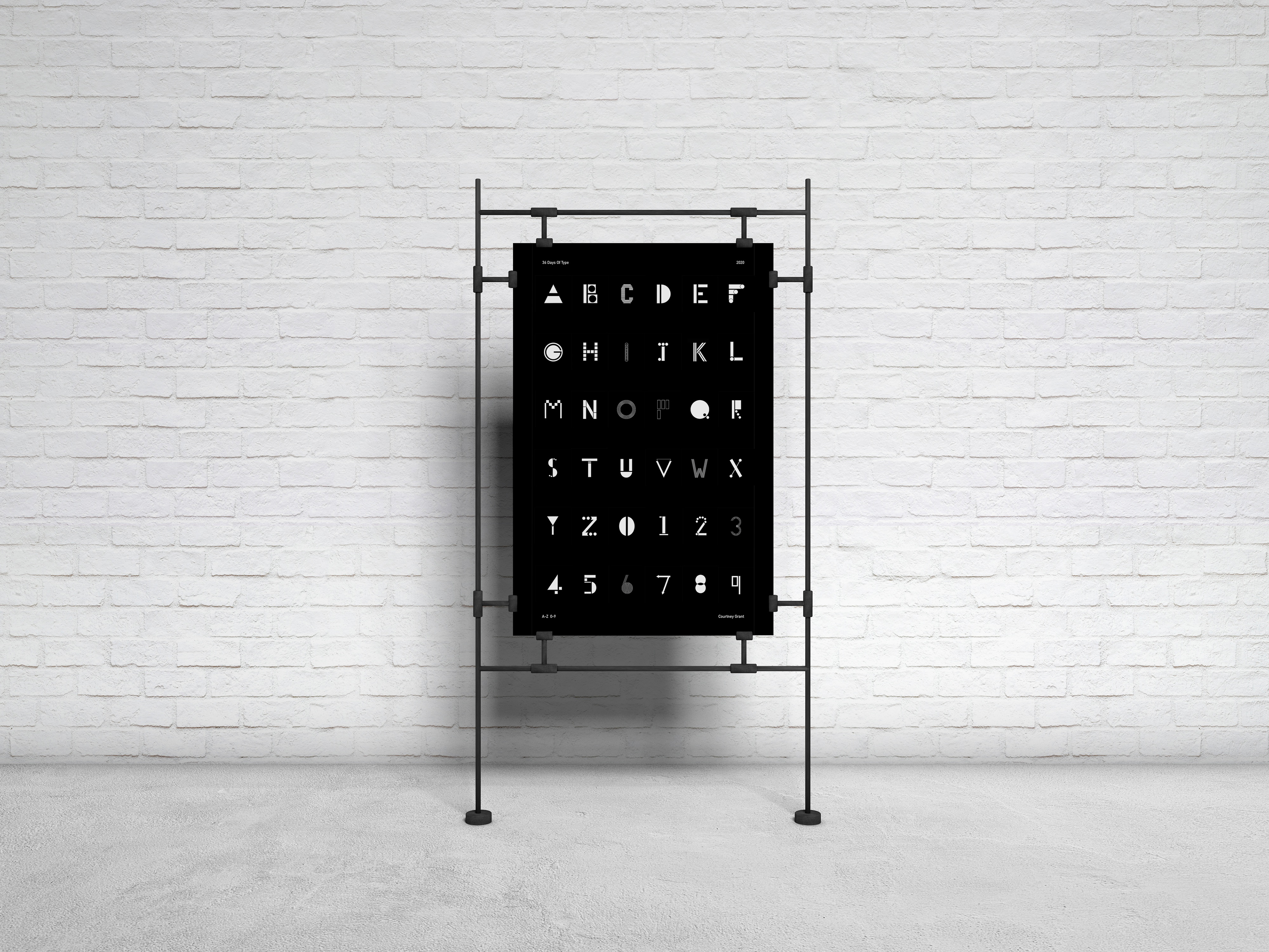
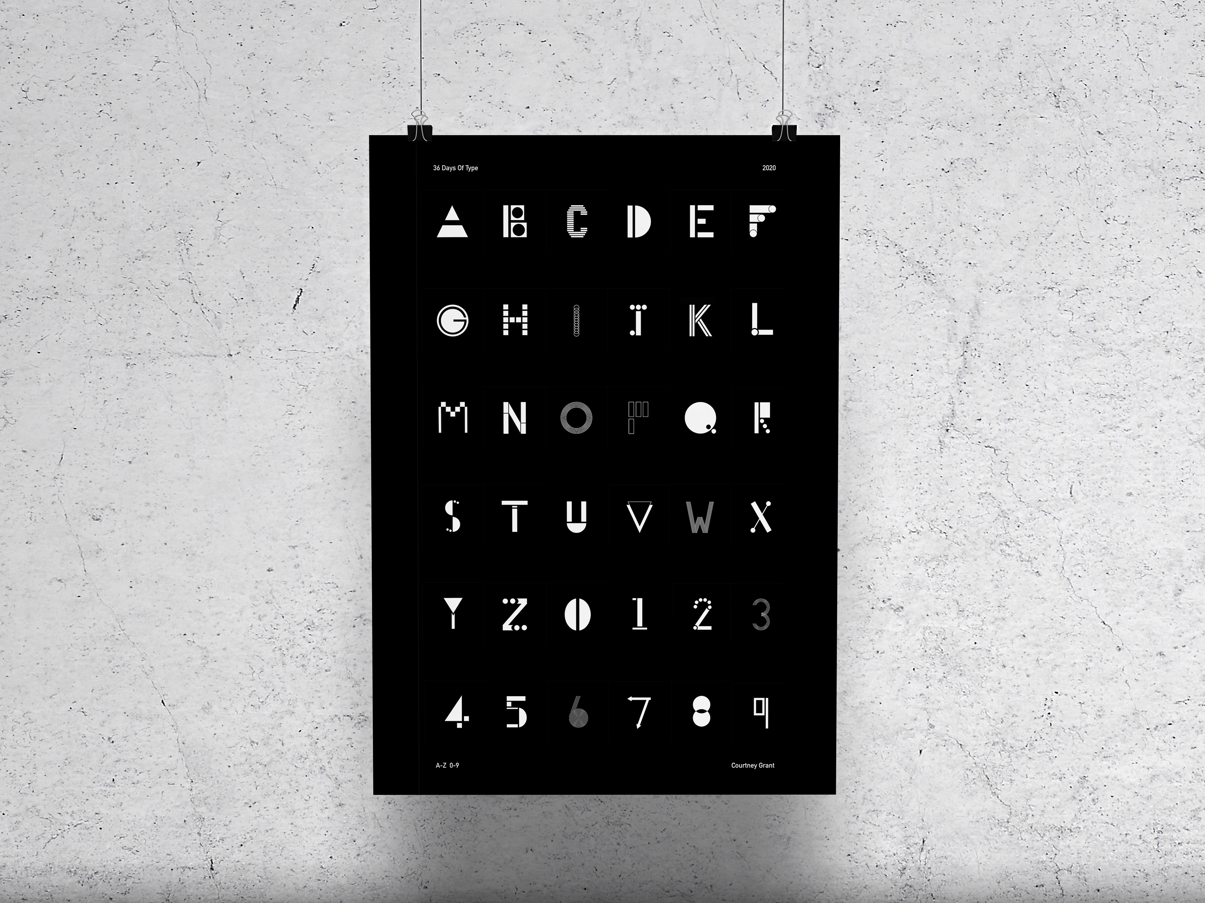
Brief: 36 Days of Type is a project that invites designers, illustrators and graphic artists to express their particular interpretation of the letters and numbers of the Latin alphabet. A yearly open call exploring the creative boundaries of letterforms, where participants are challenged to design a letter or number for each day for 36 consecutive days, as a global and simultaneous act showing the outcome of the ability to represent the same symbol from thousands of different perspectives. A project that aims to be a space for creation around typography and its endless graphic possibilities.
Aim: I wanted to set myself a brief within the very open brief from 36 Days to make it more of a challenge. I set the aim of only using a monochrome colour palette and mundane shapes to define letters and numbers of the alphabet.
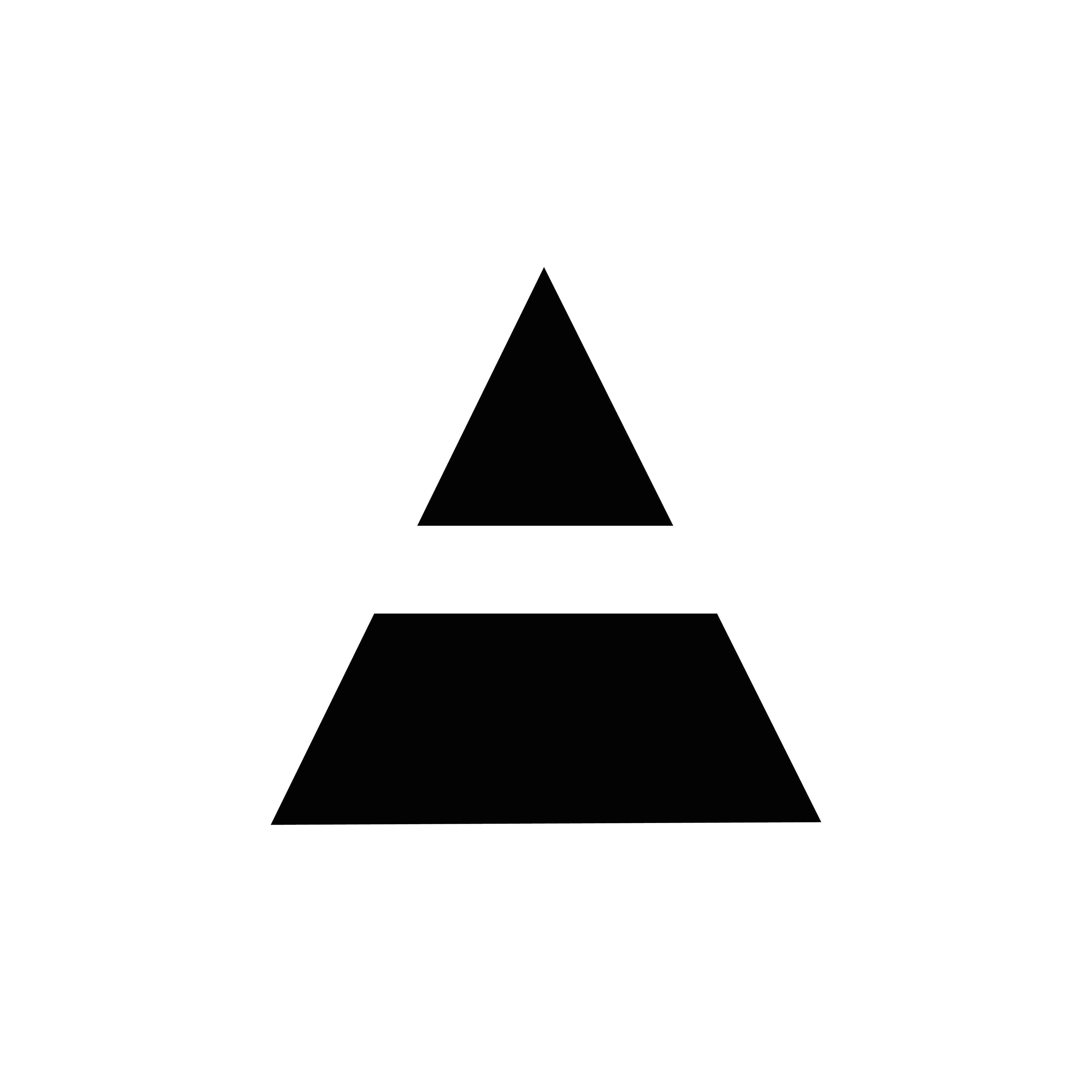
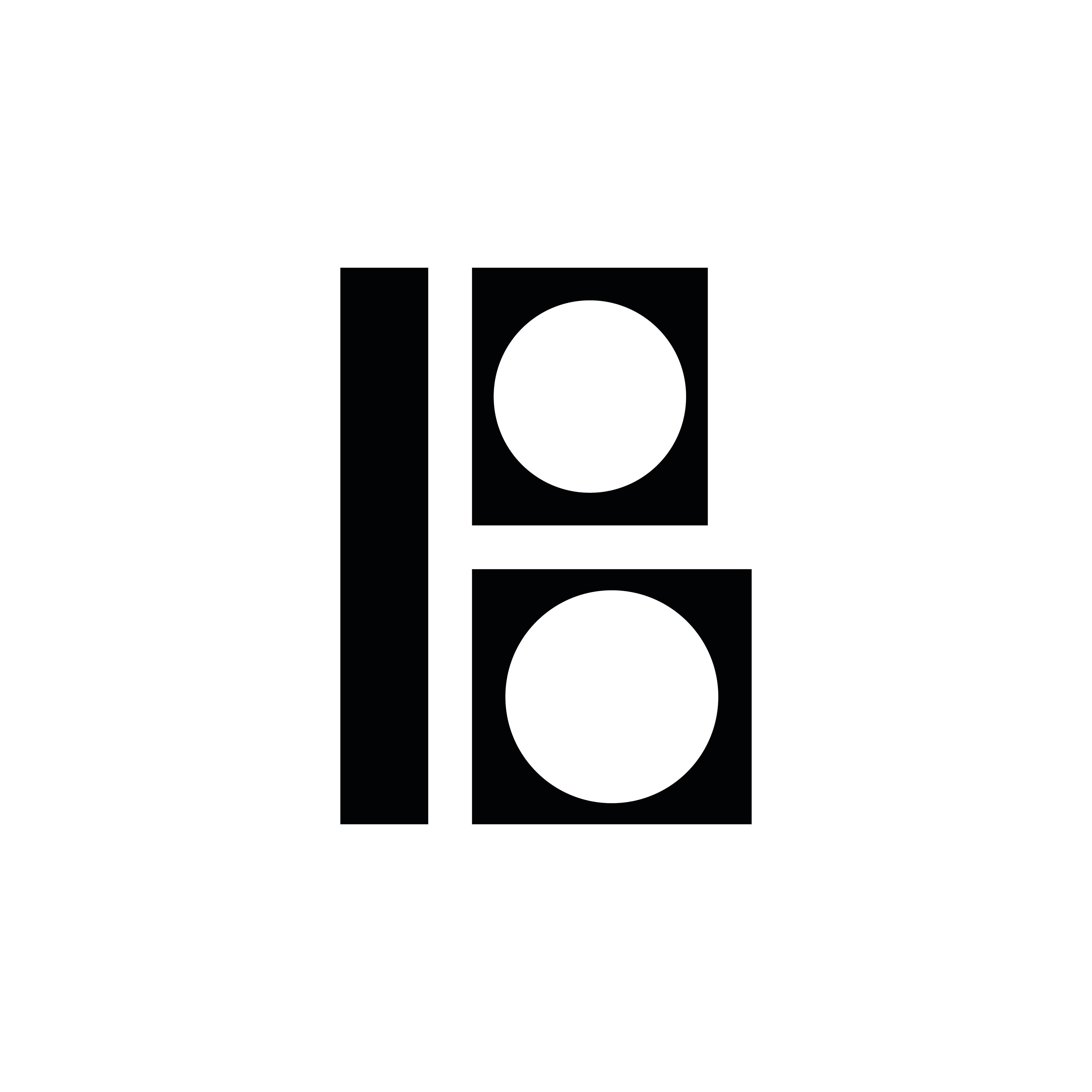
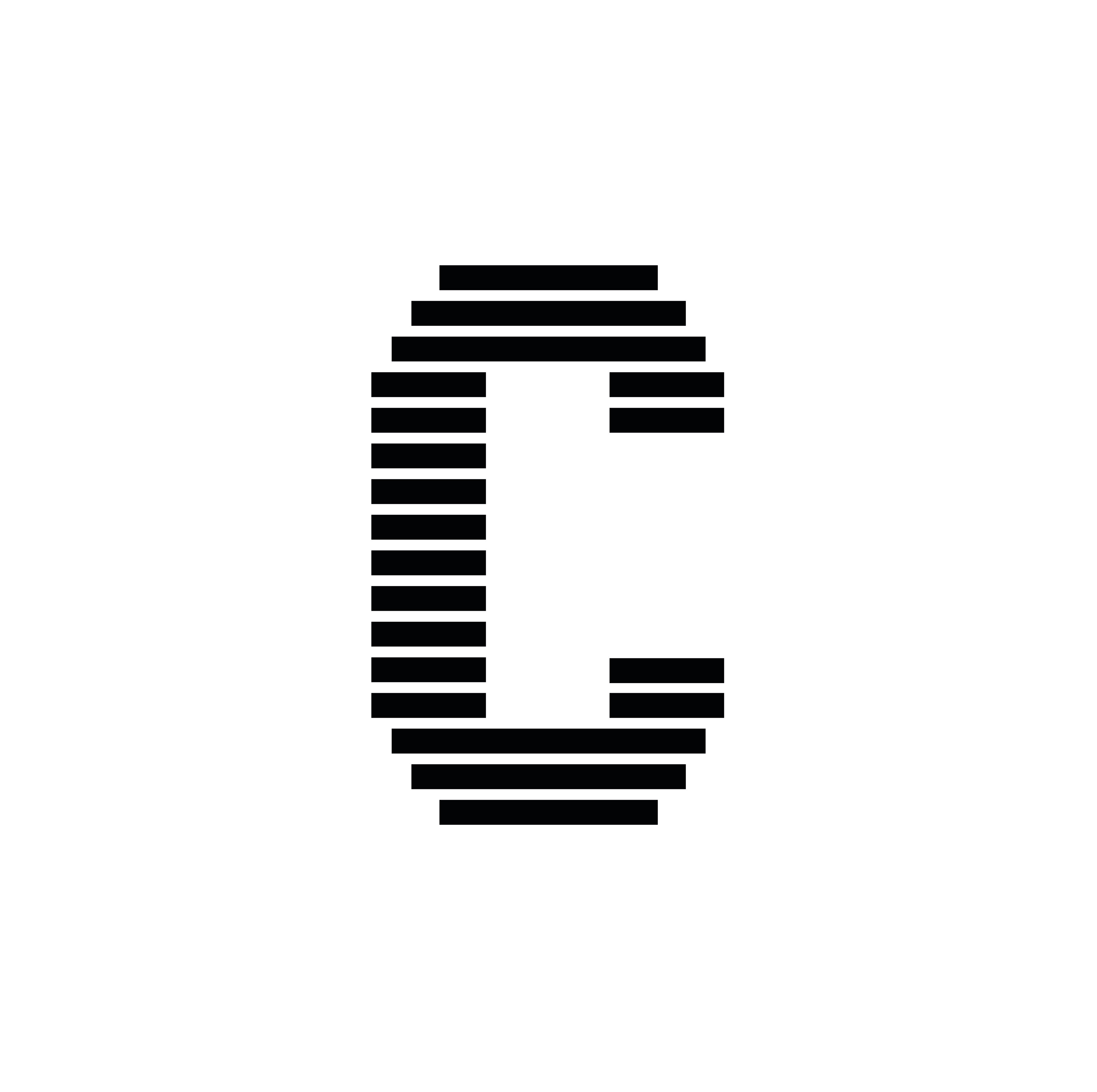
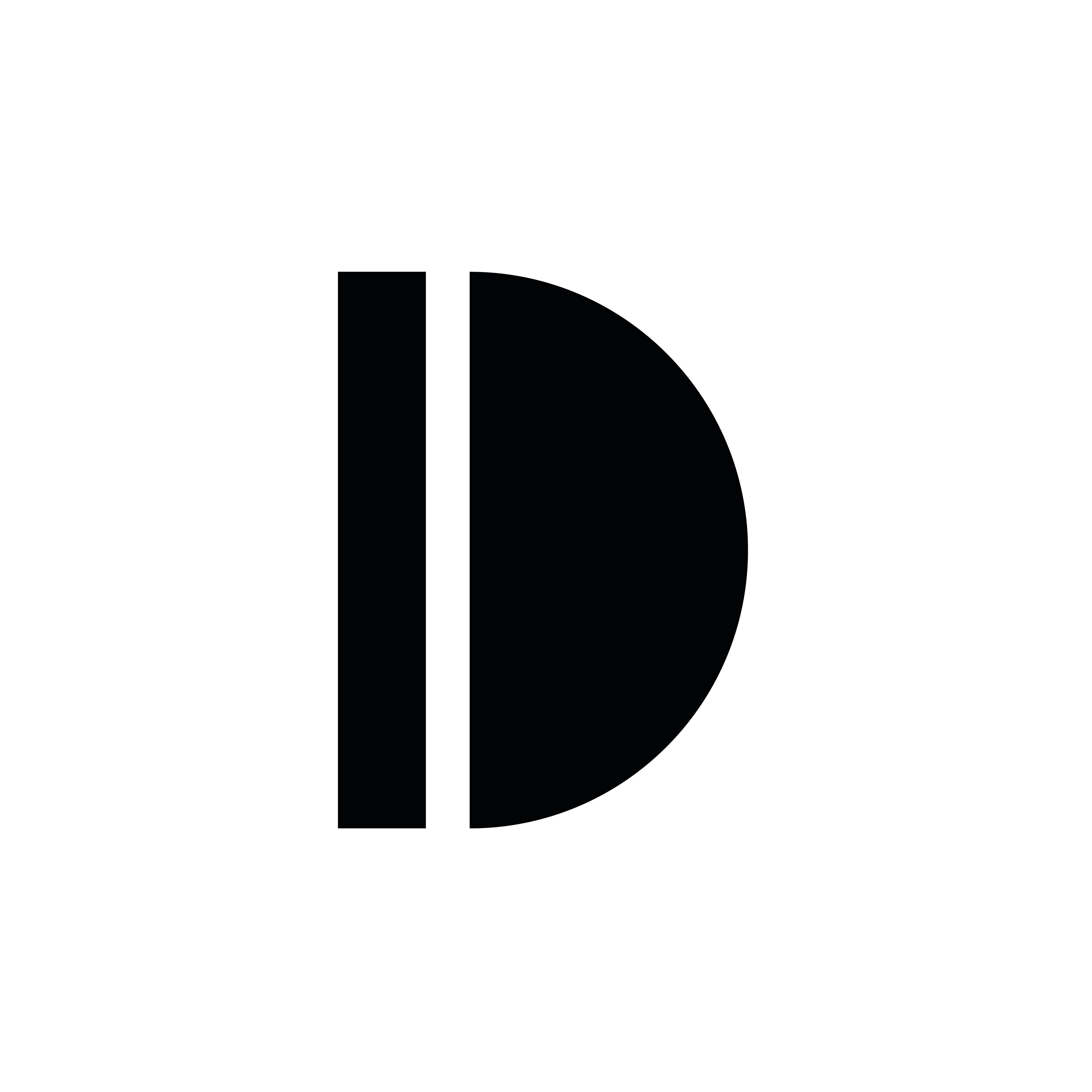
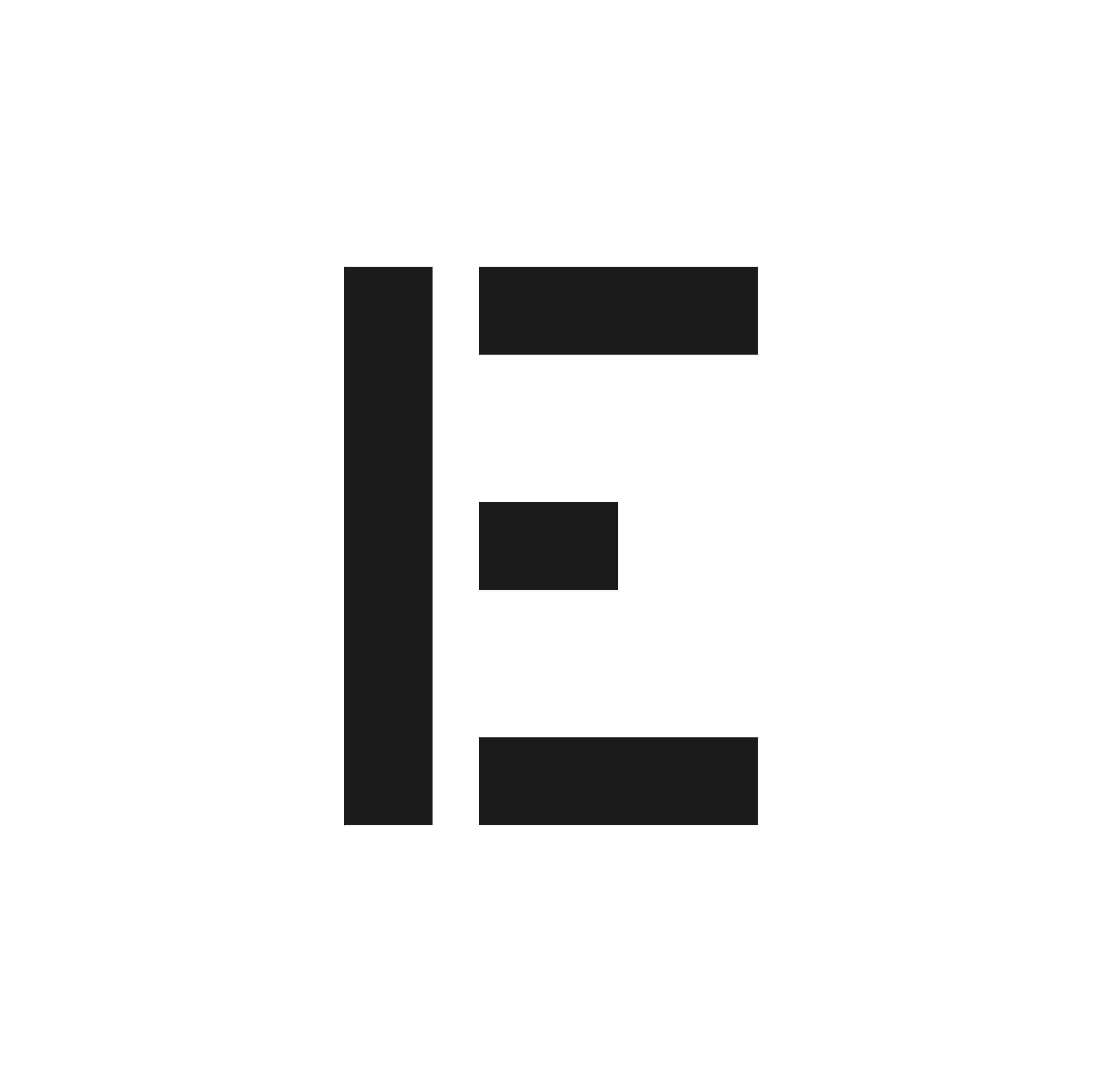

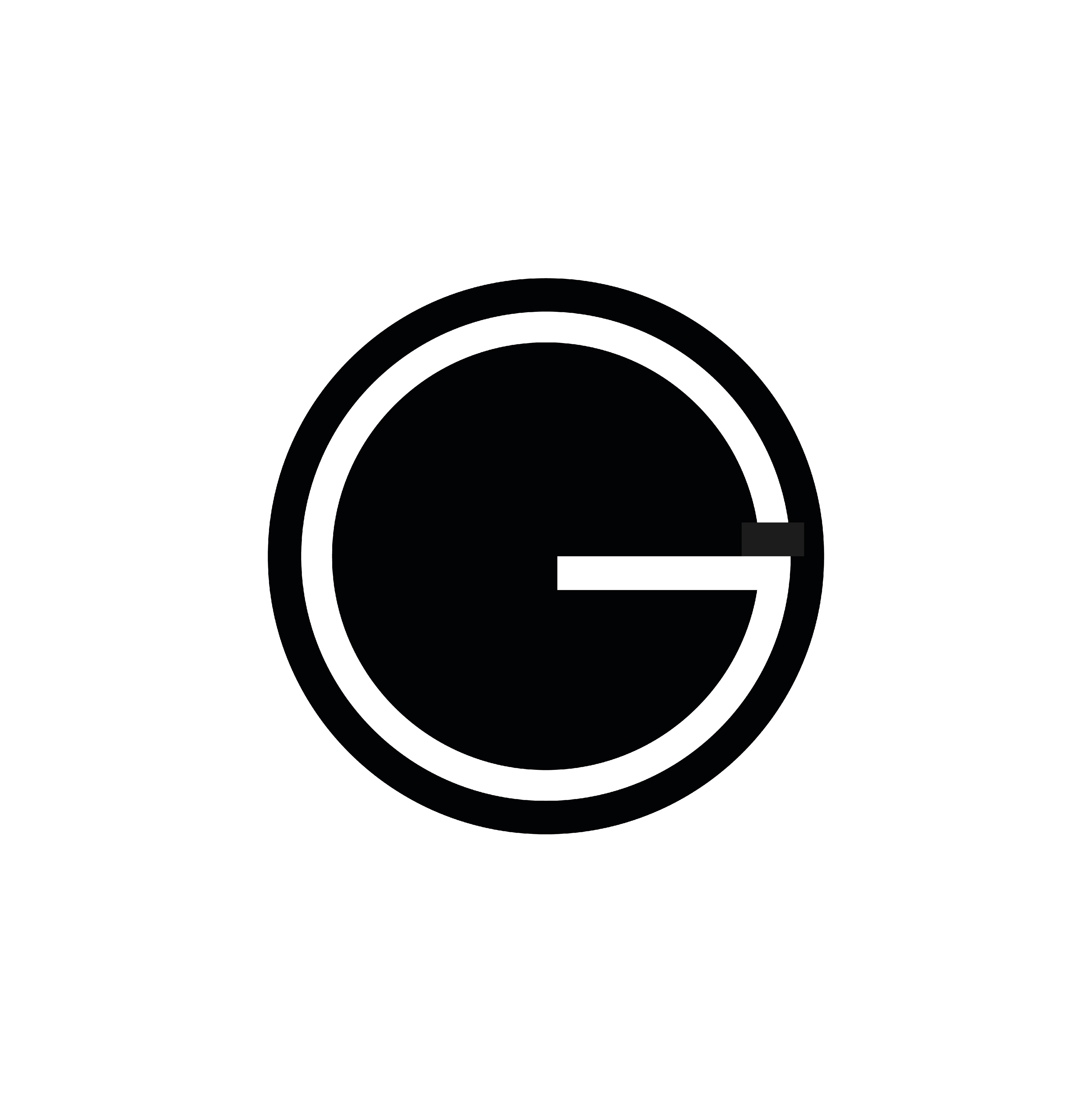

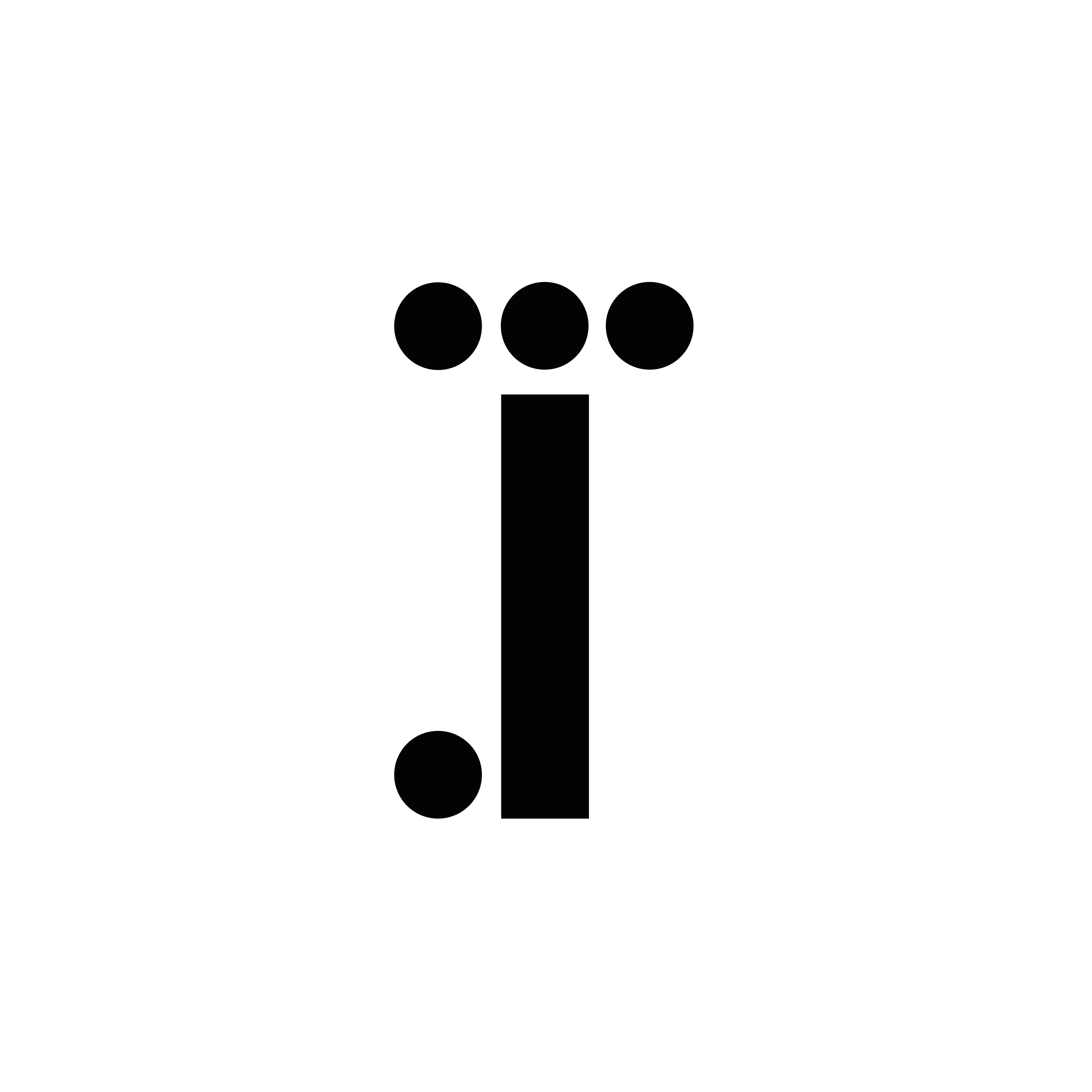
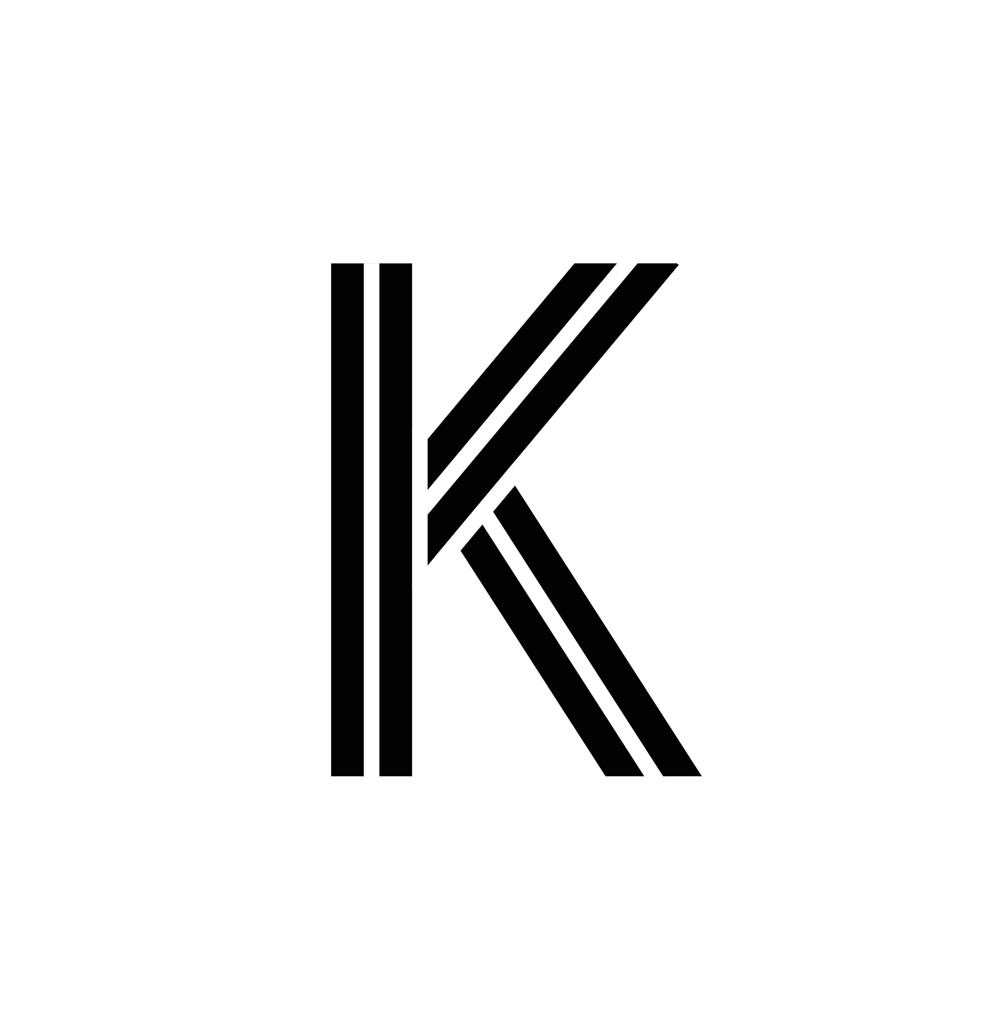
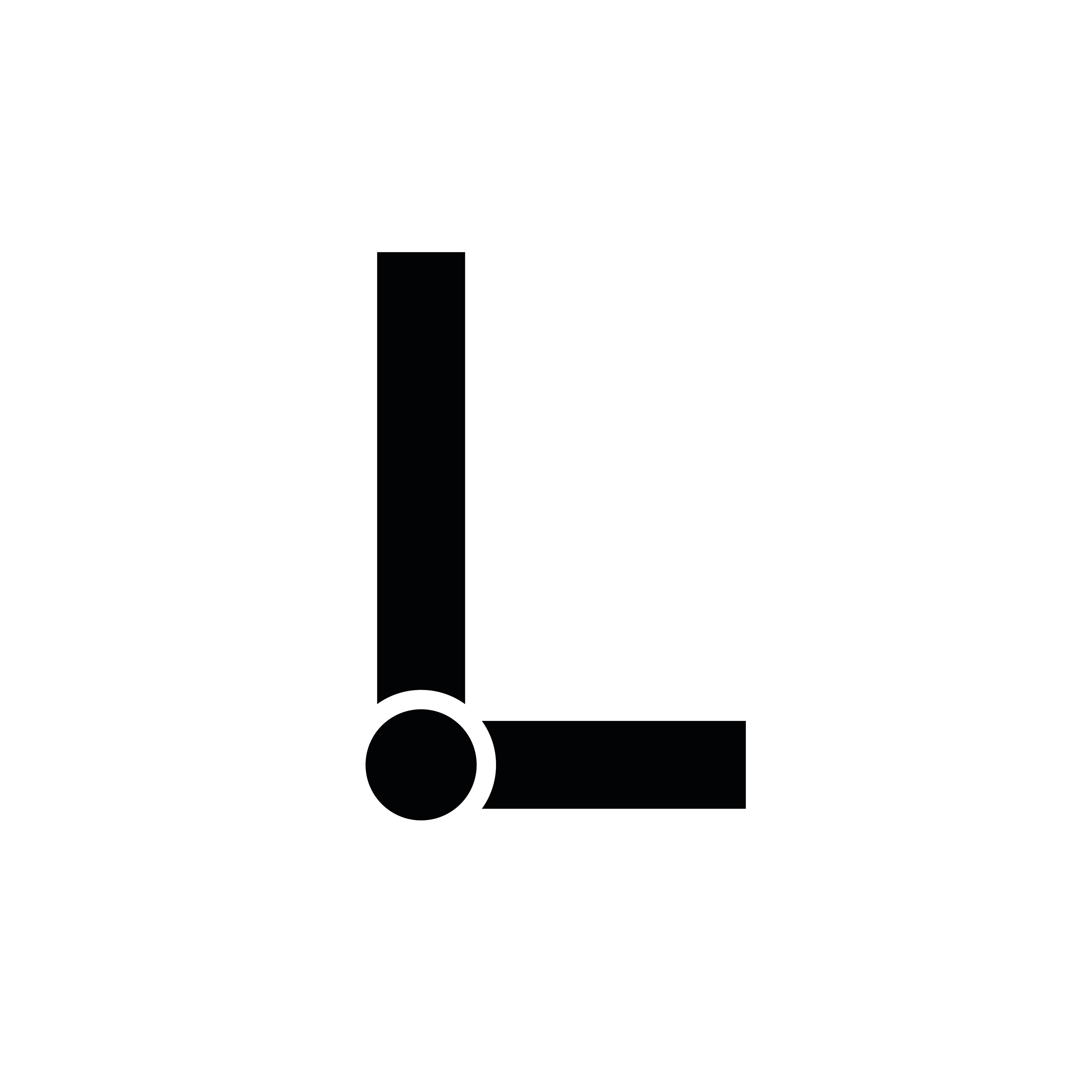

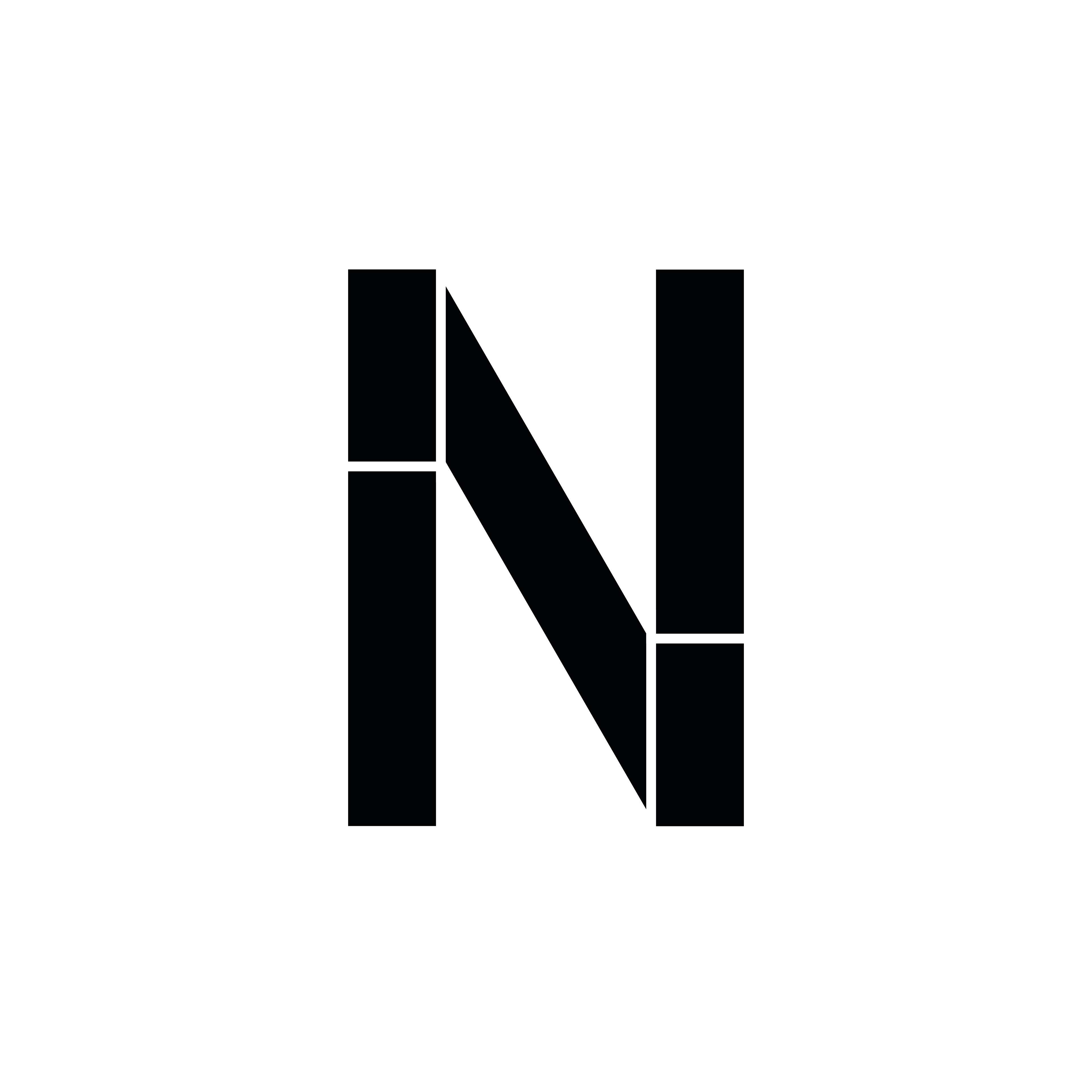
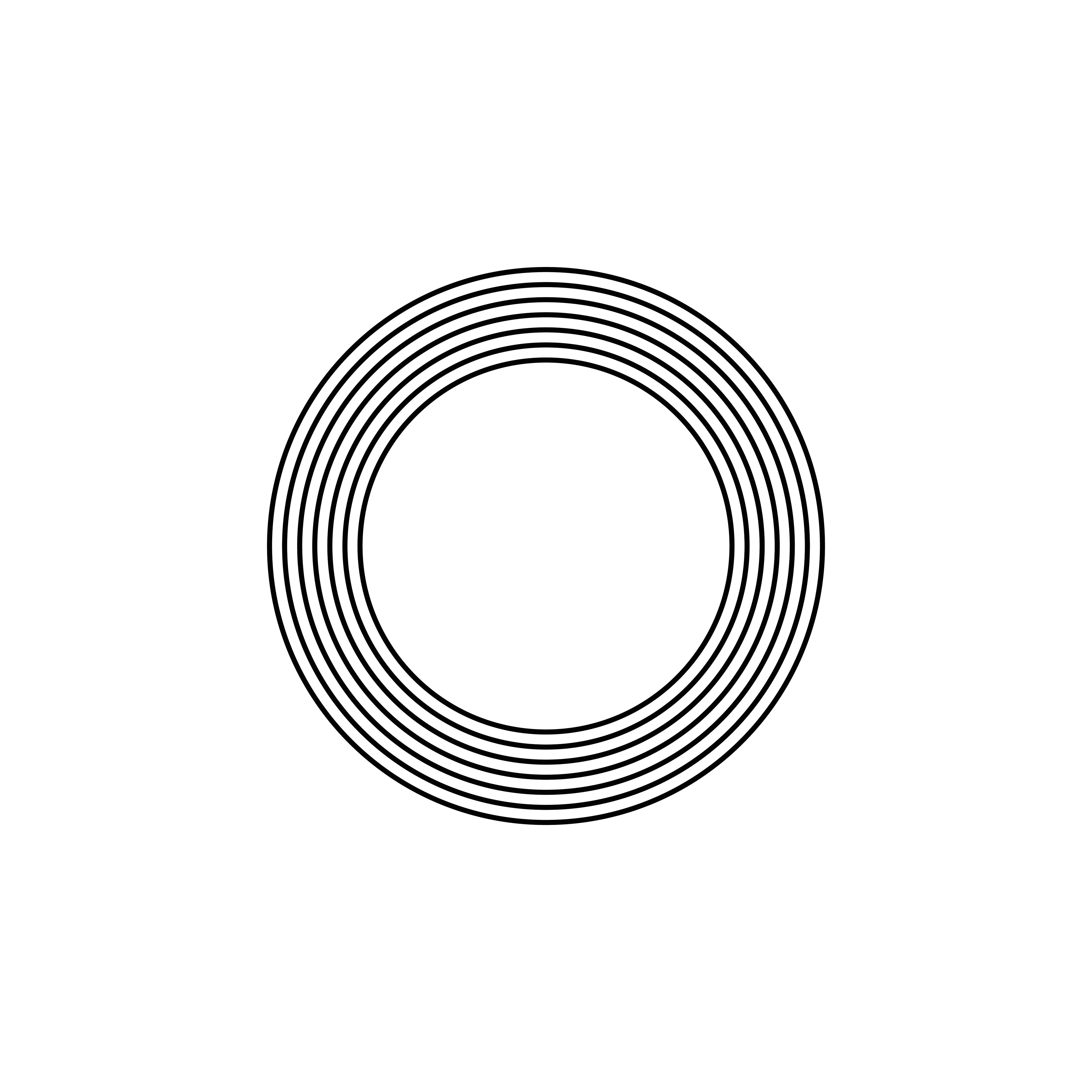
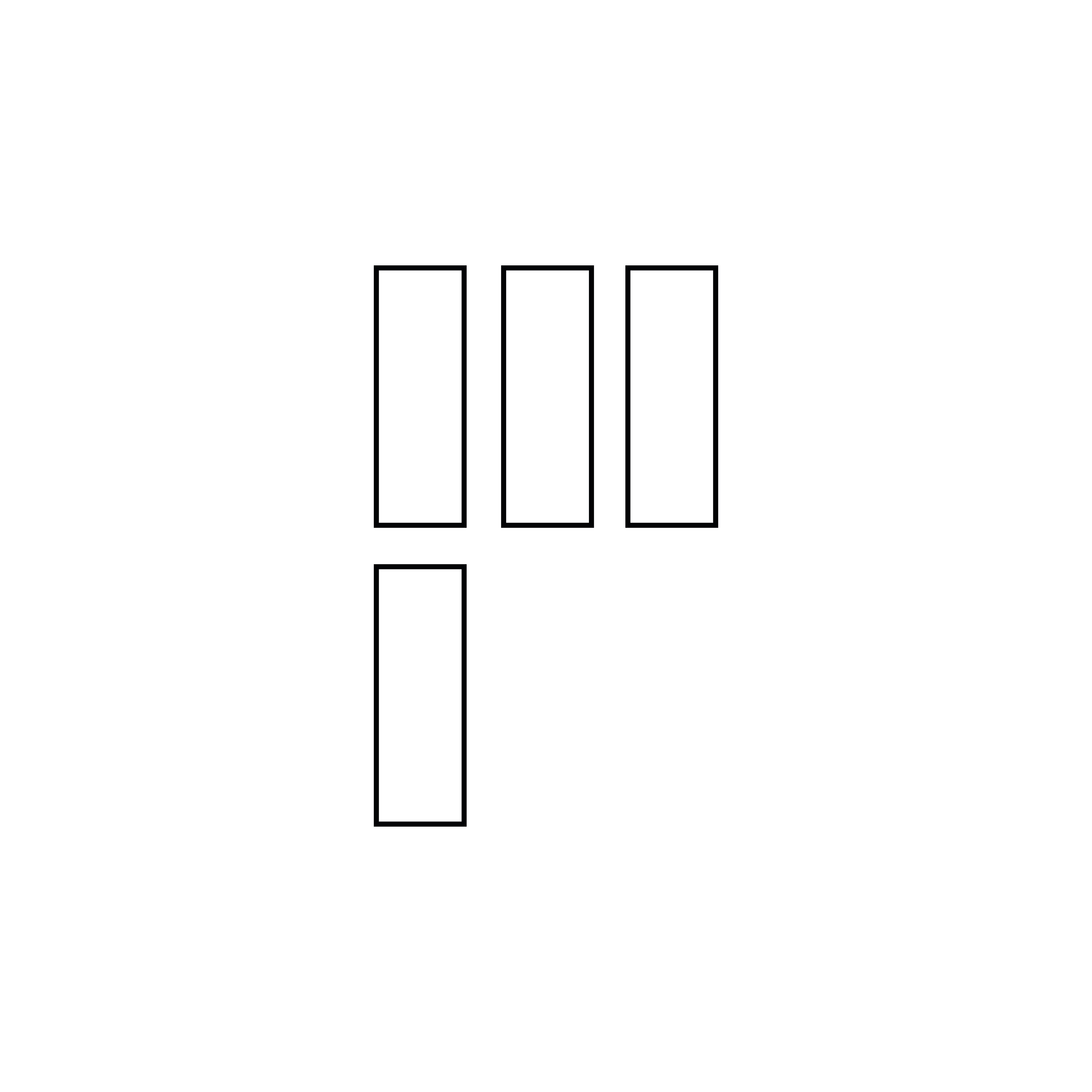

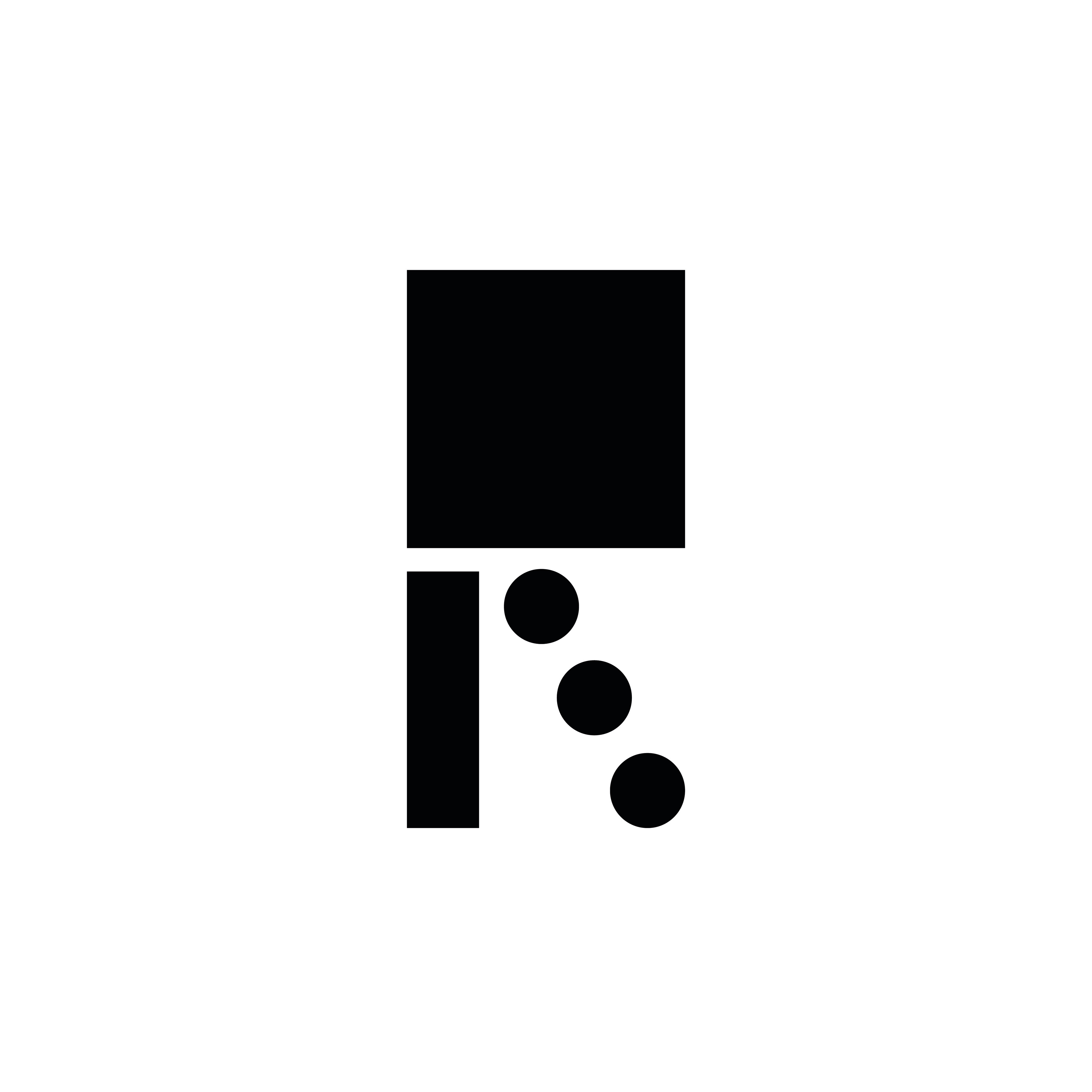
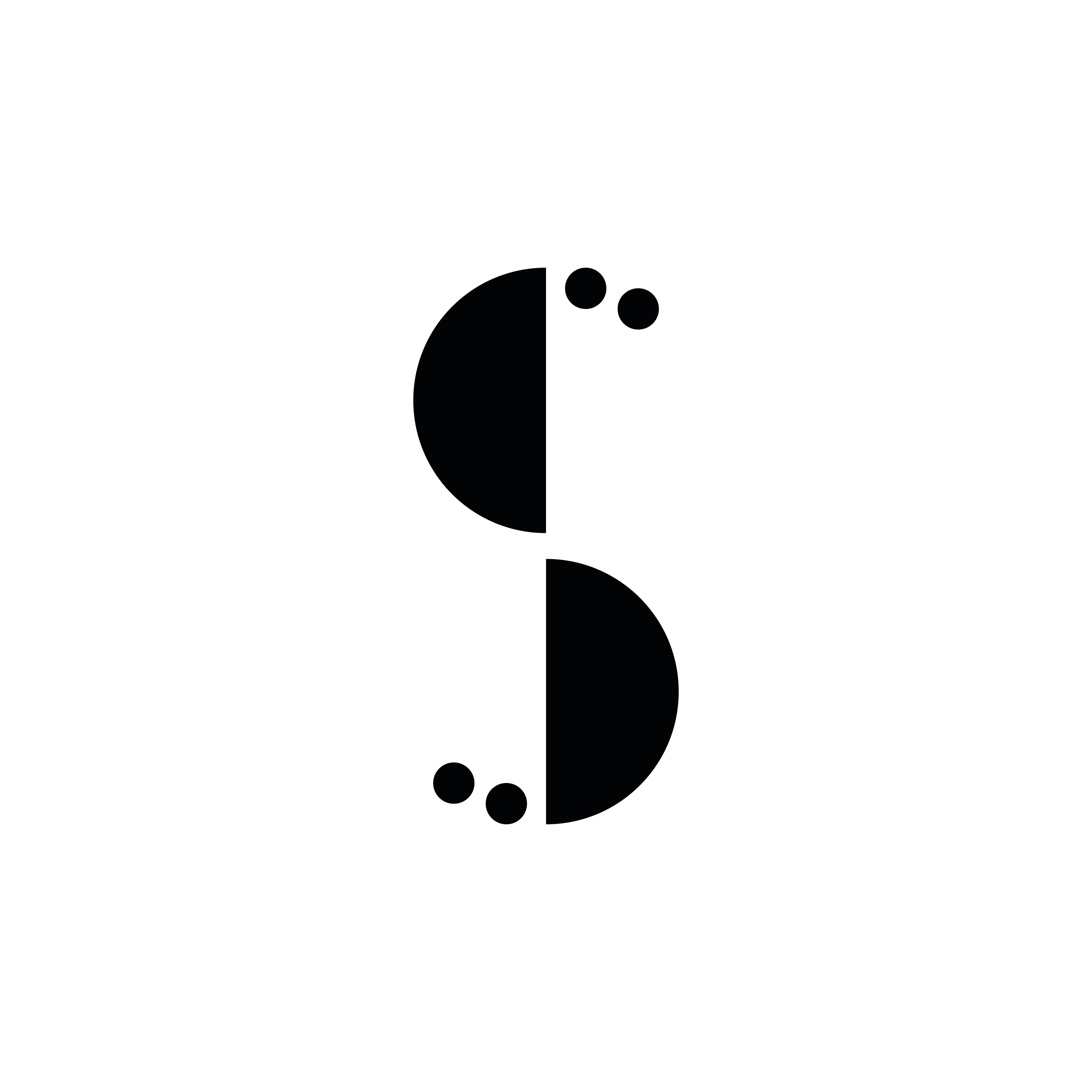
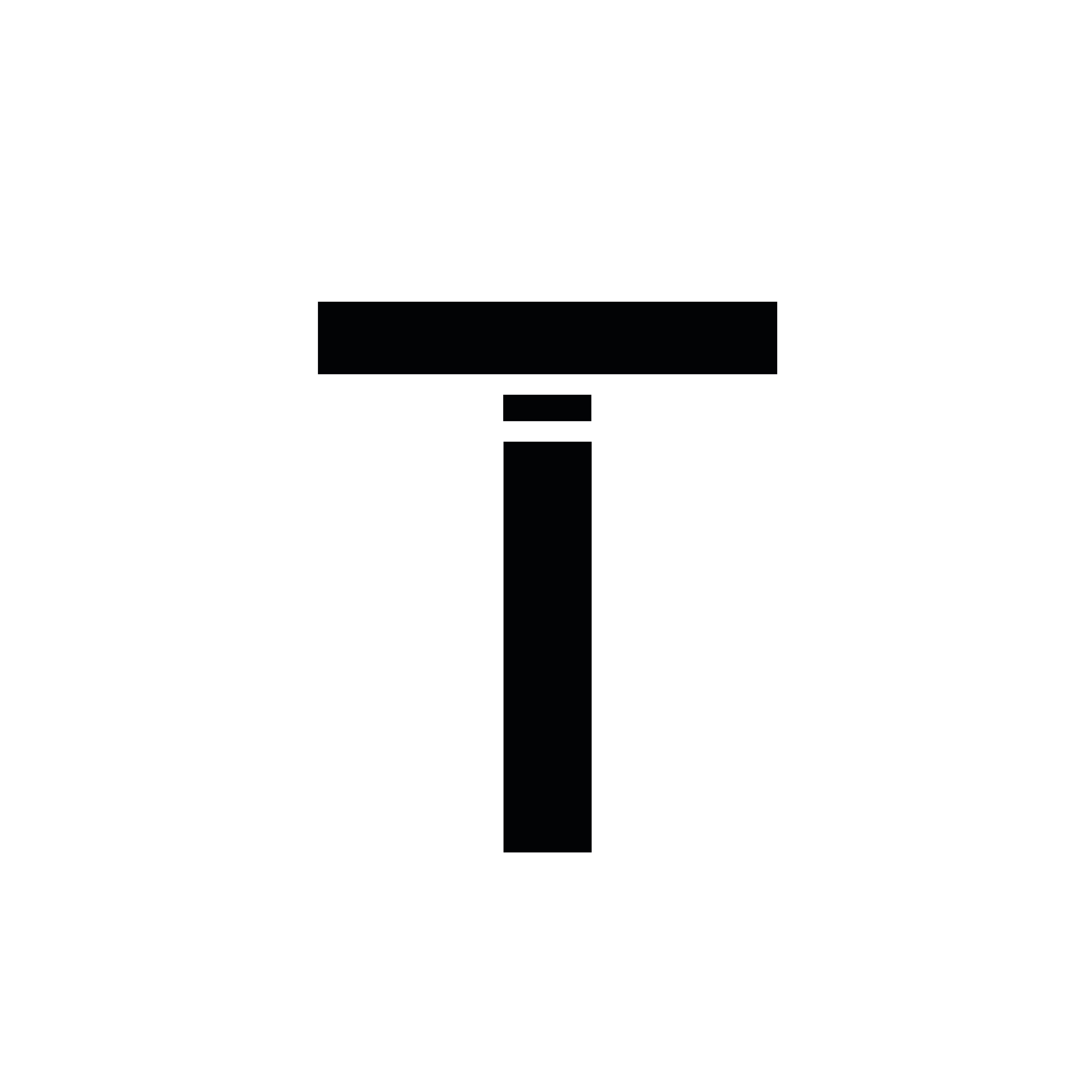
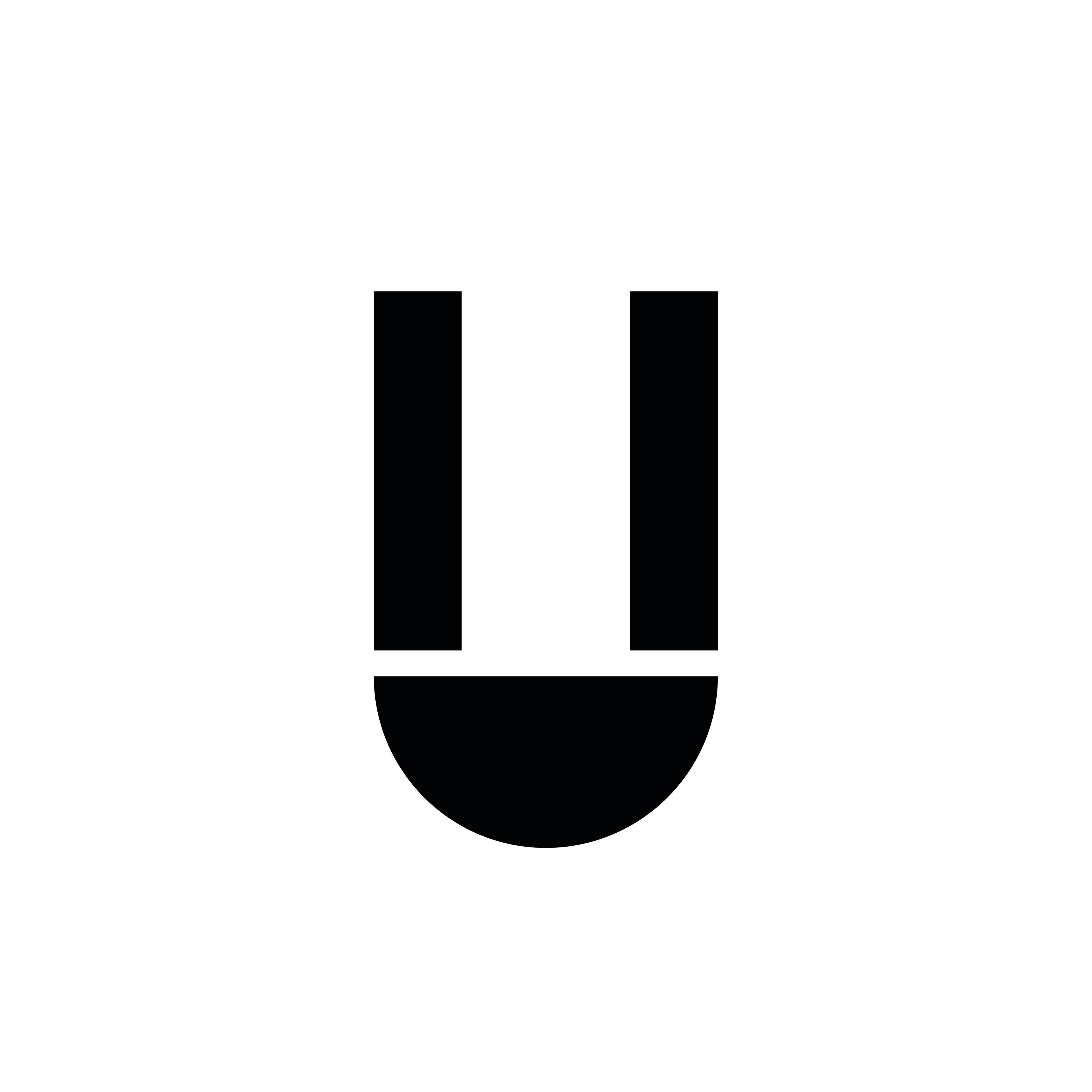
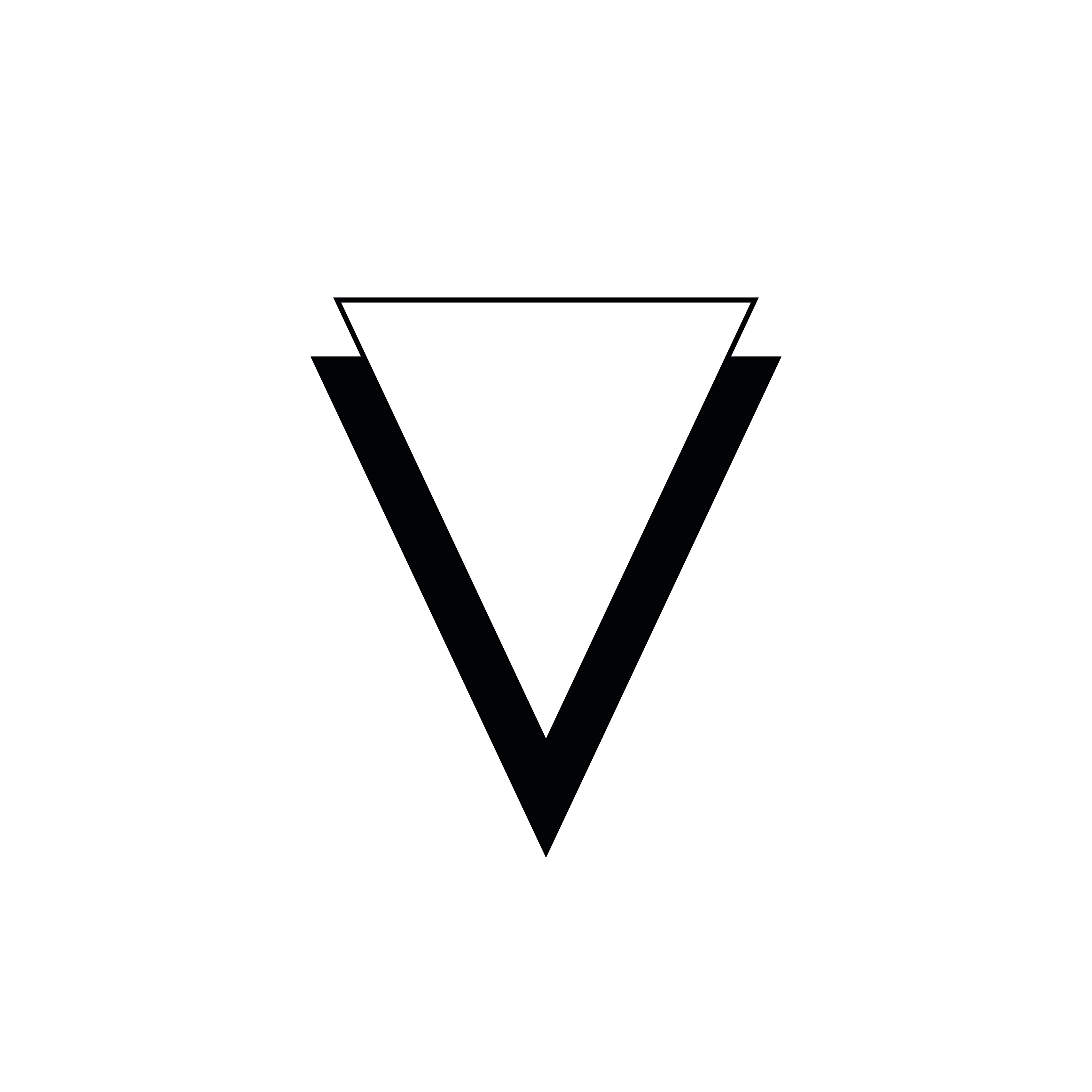
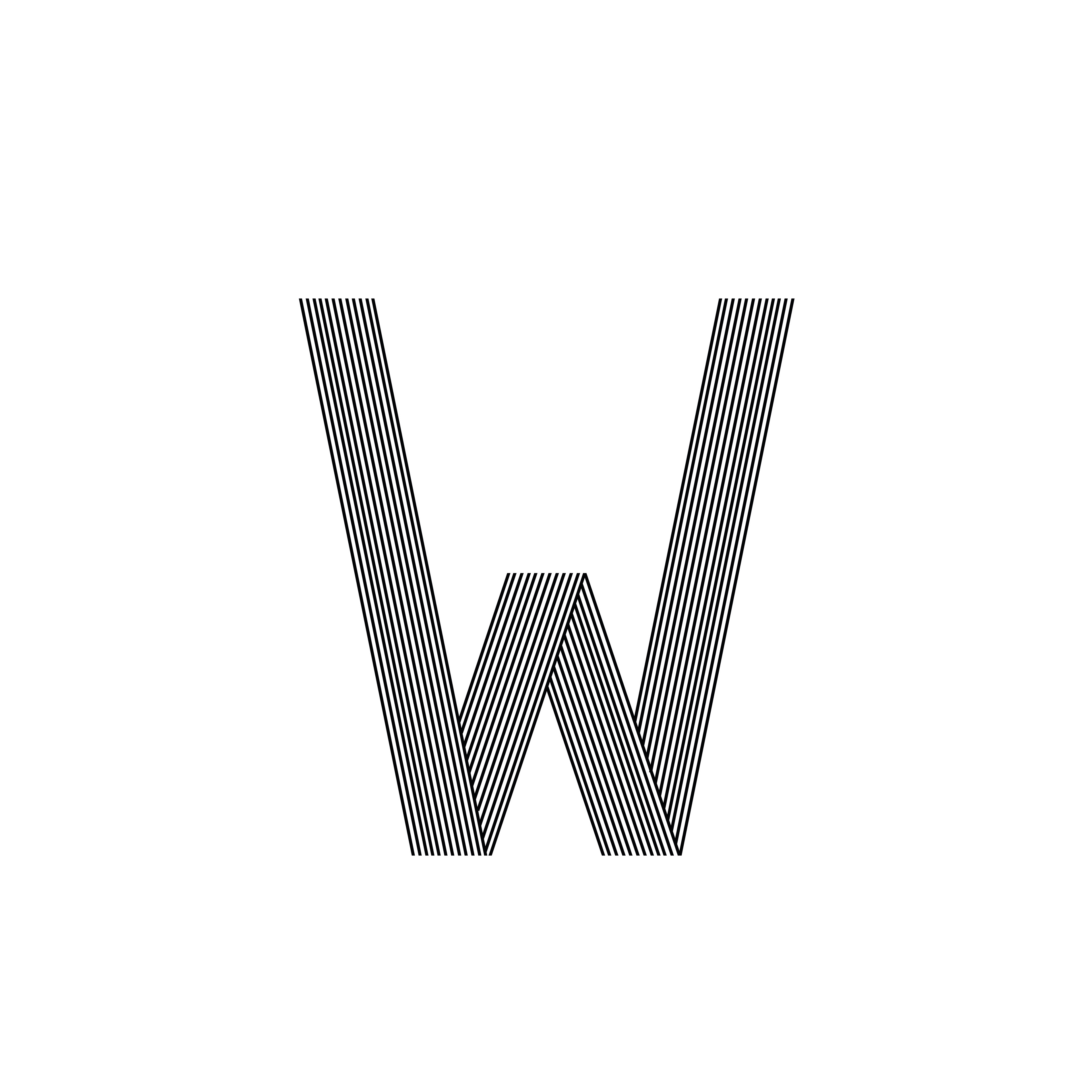
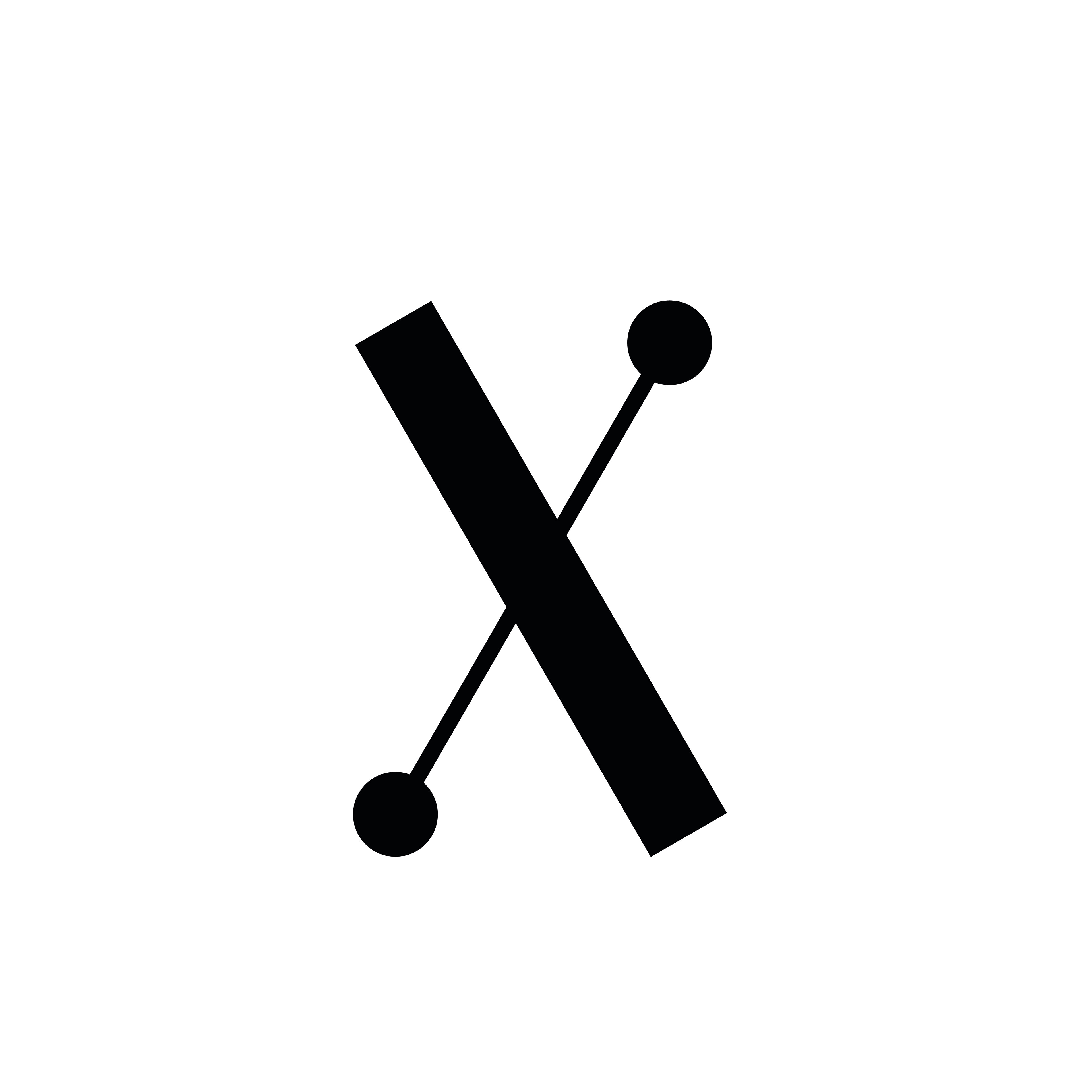
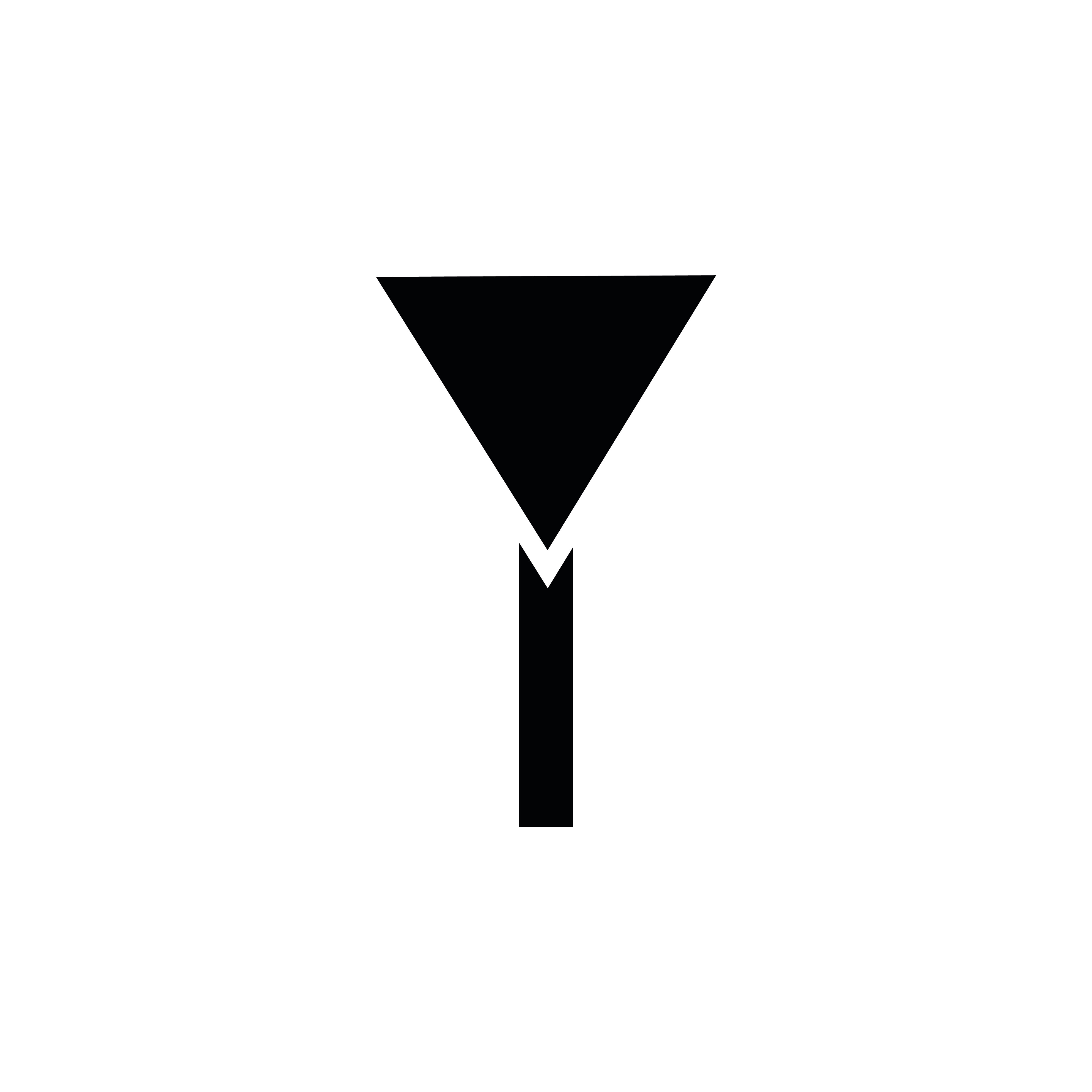
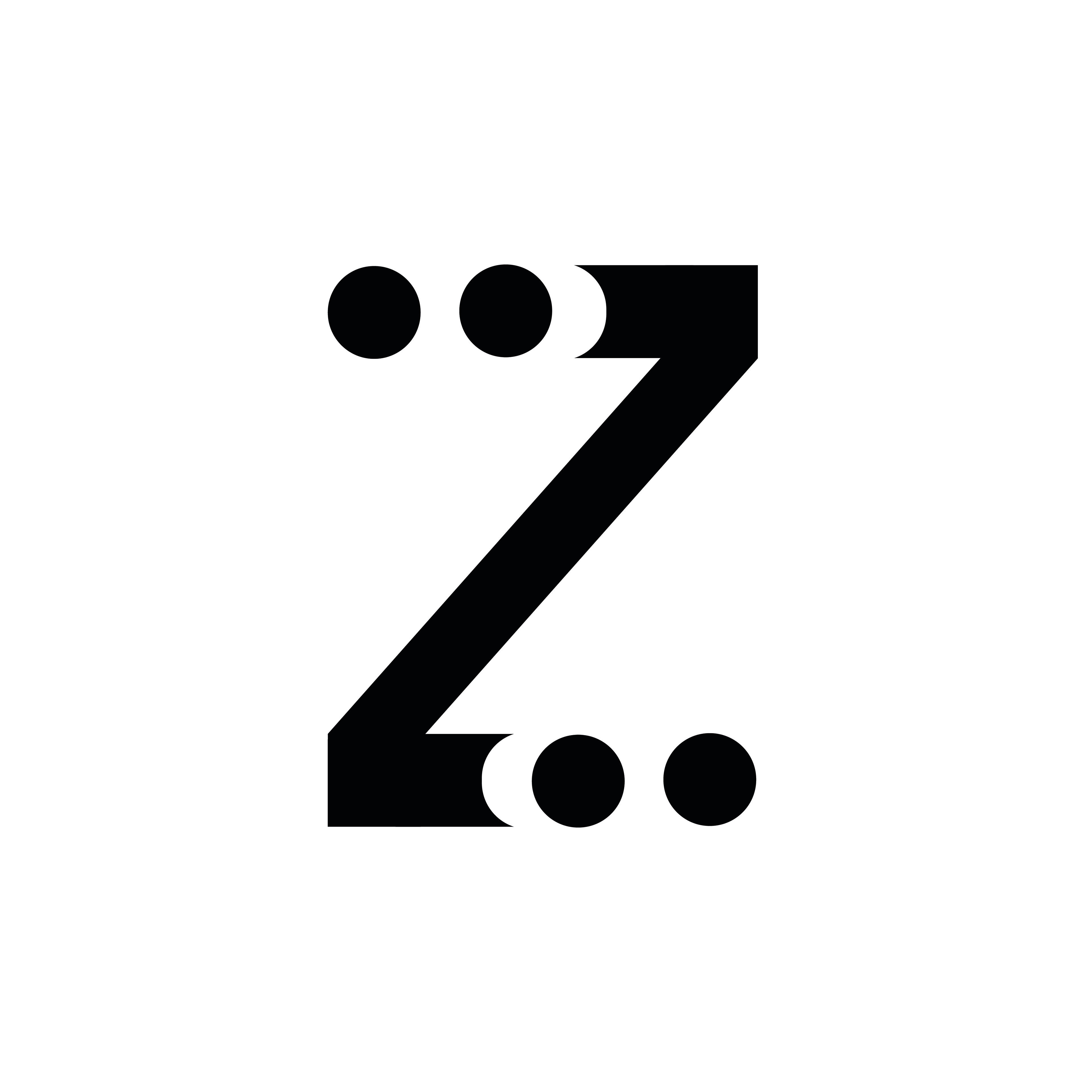
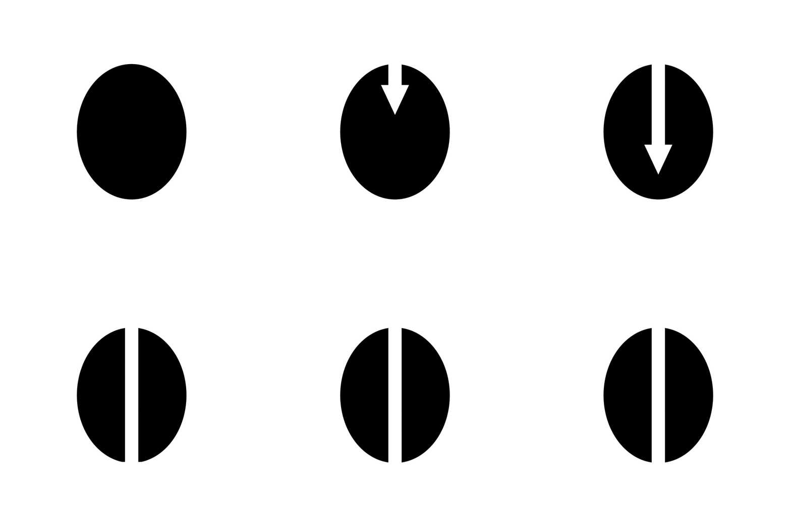
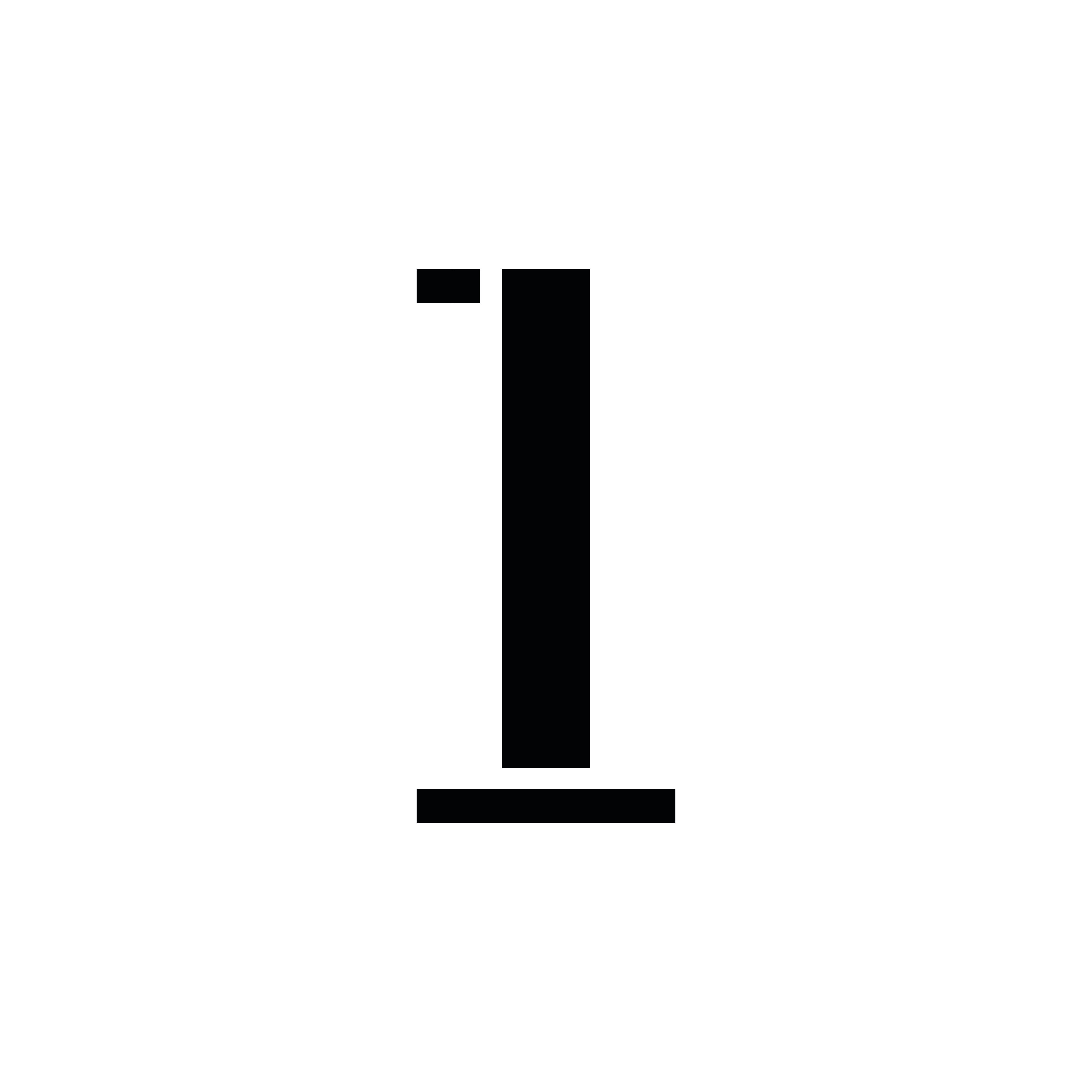
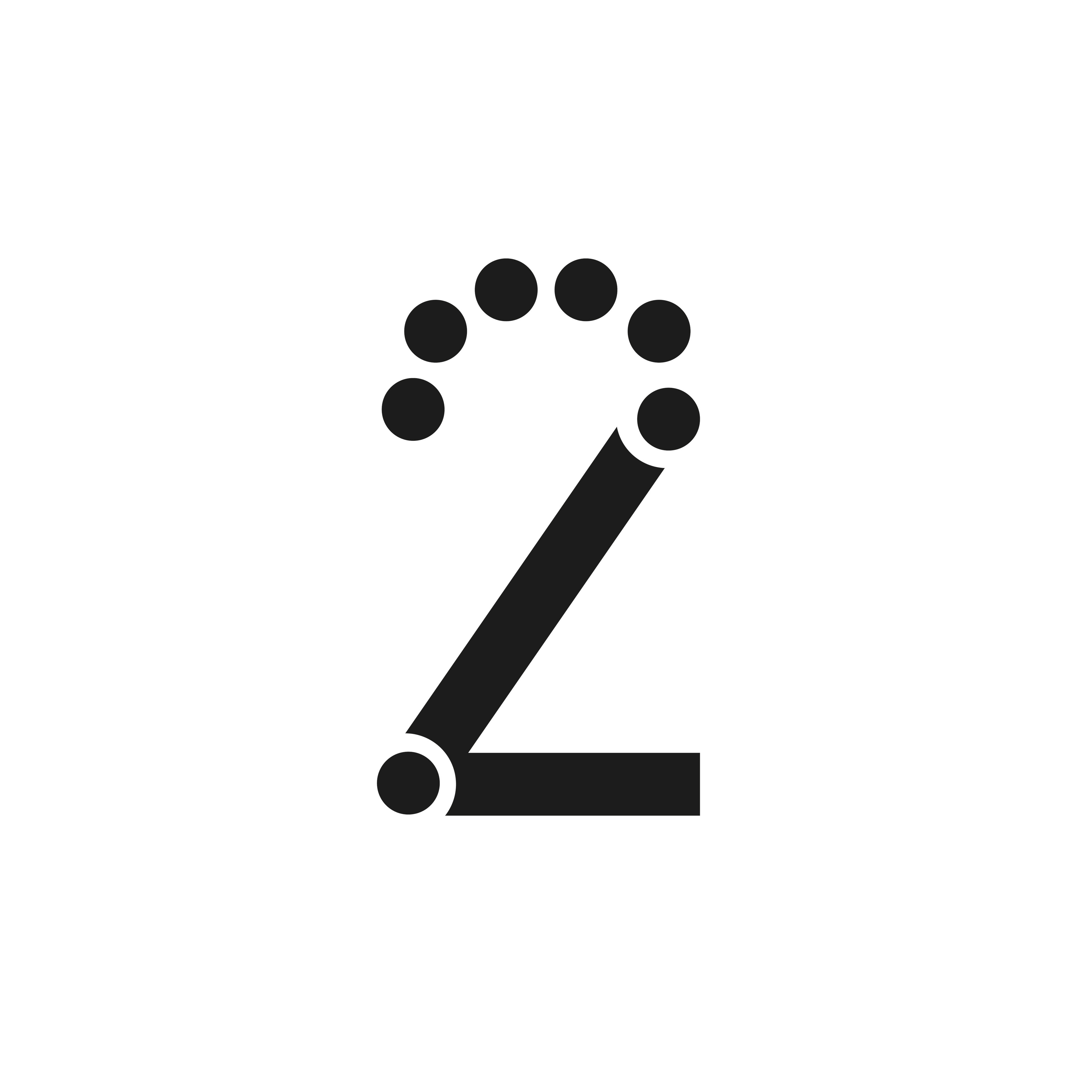
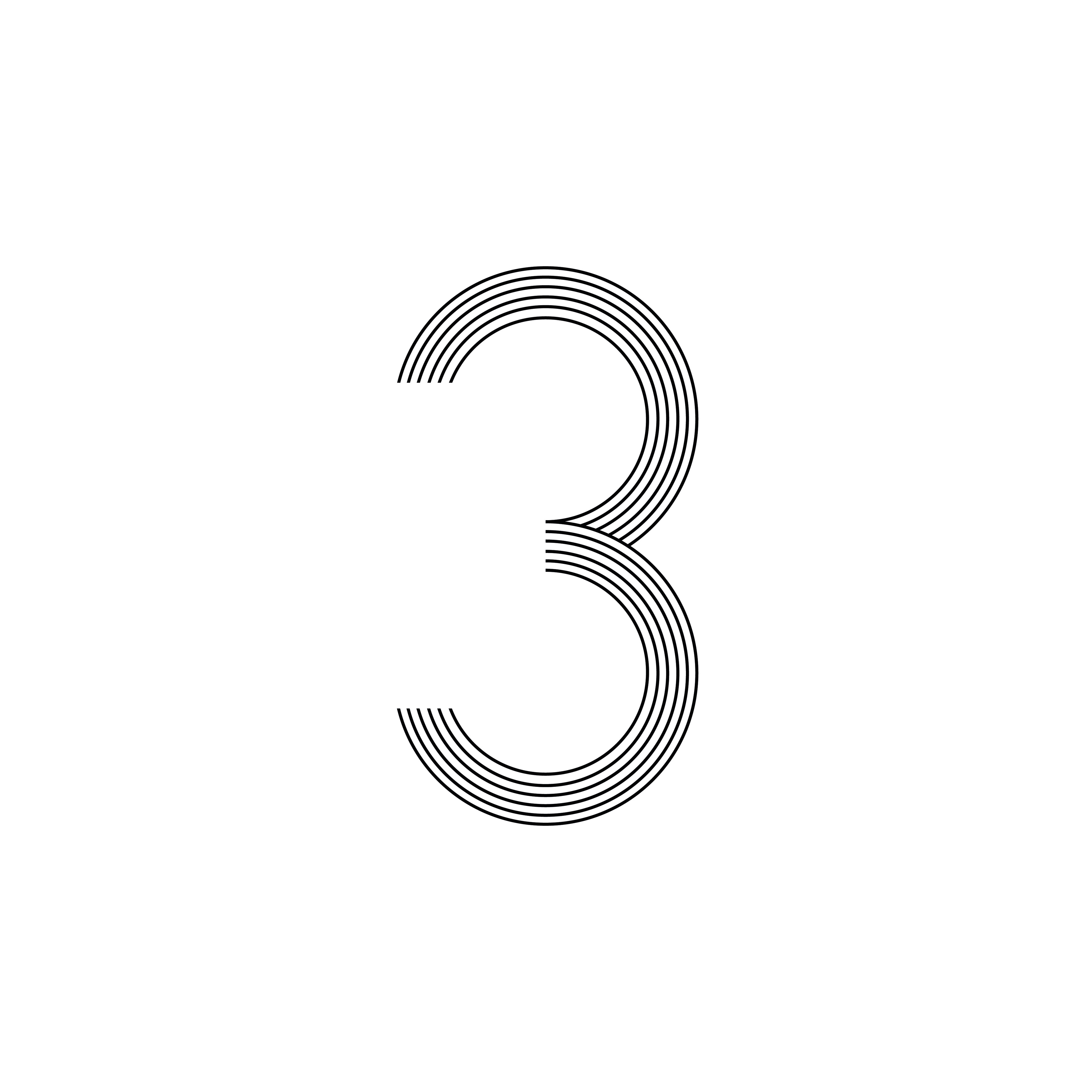
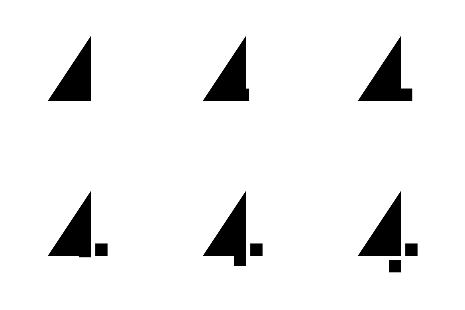

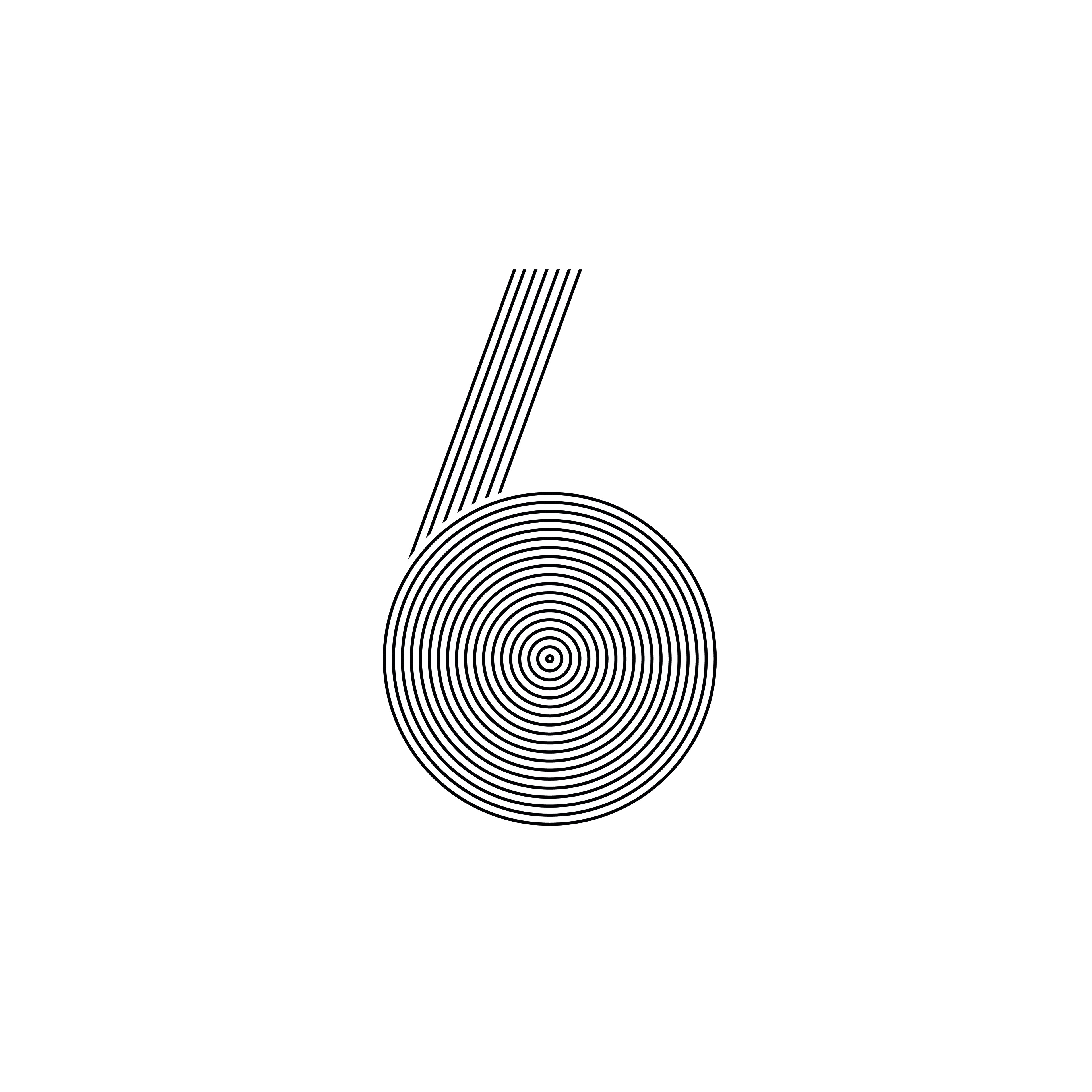
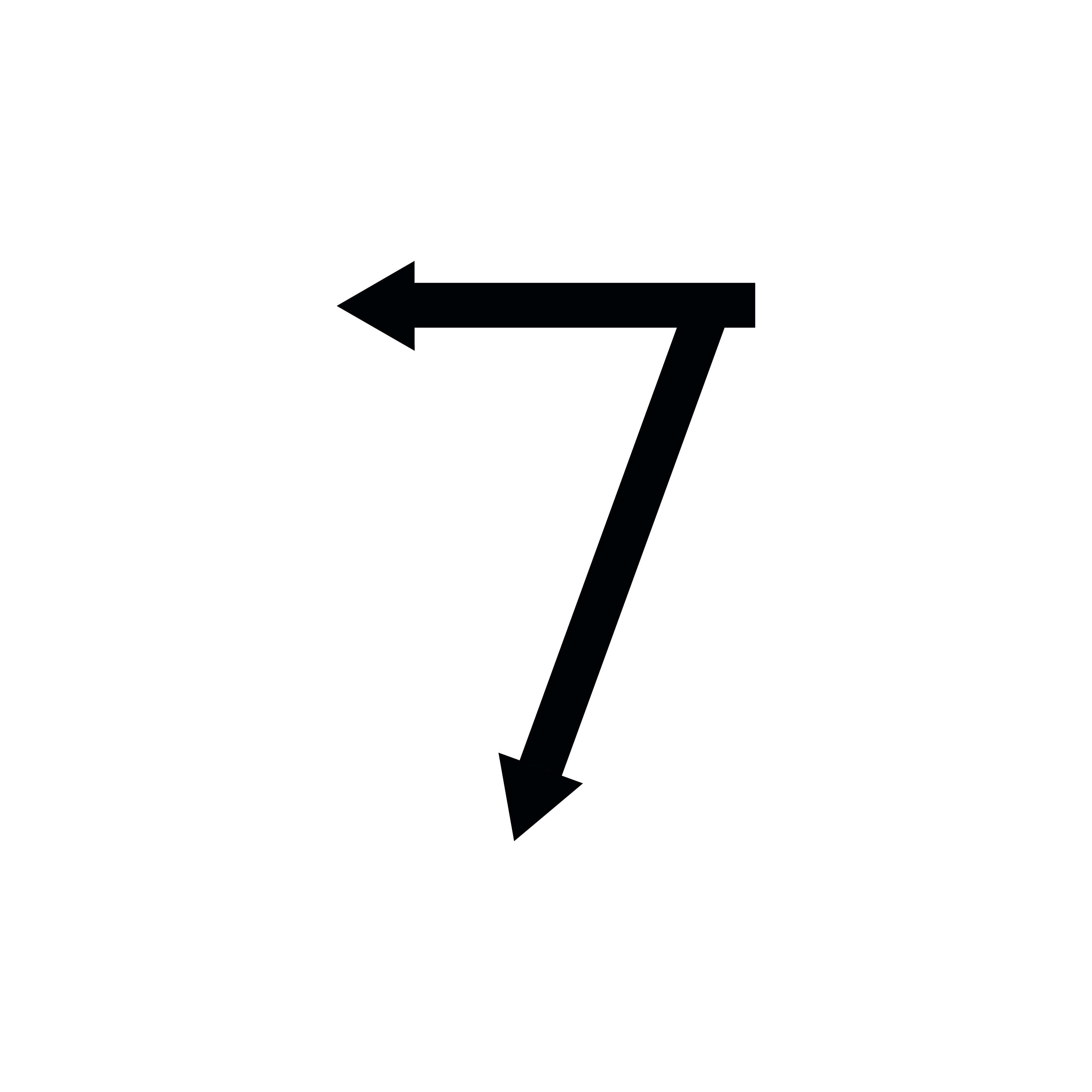
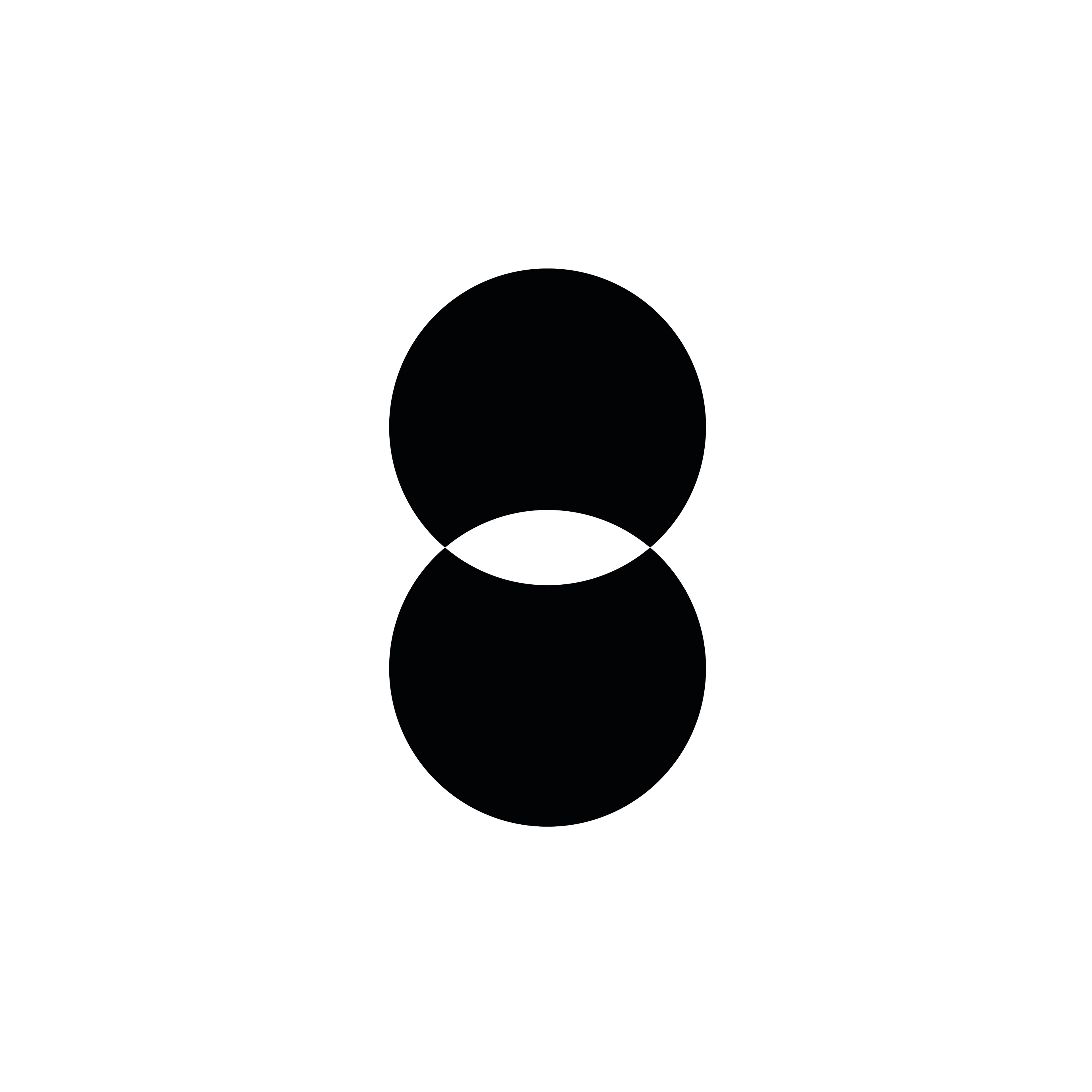
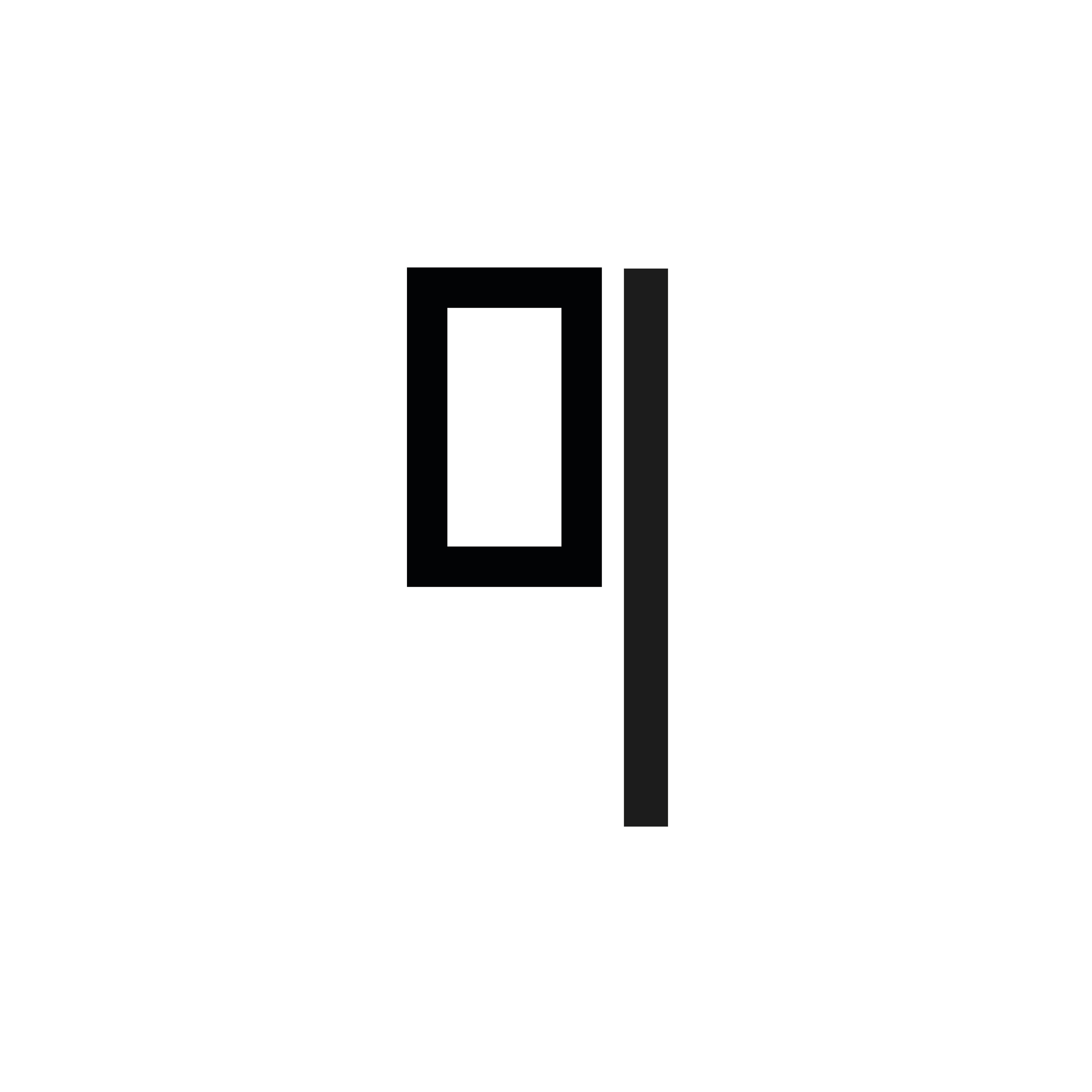
Process: I started off designing all my letters and numbers on paper to figure out which shapes could be put together to create the most clear and concise letterforms which are easy to understand but also innovative and could also possibly be animated. The main shapes I used were circles, rectangles, triangles and squares. I wanted to showcase that by taking boring, mundane shapes and using them together you can create new shapes that have a different, more significant meaning.
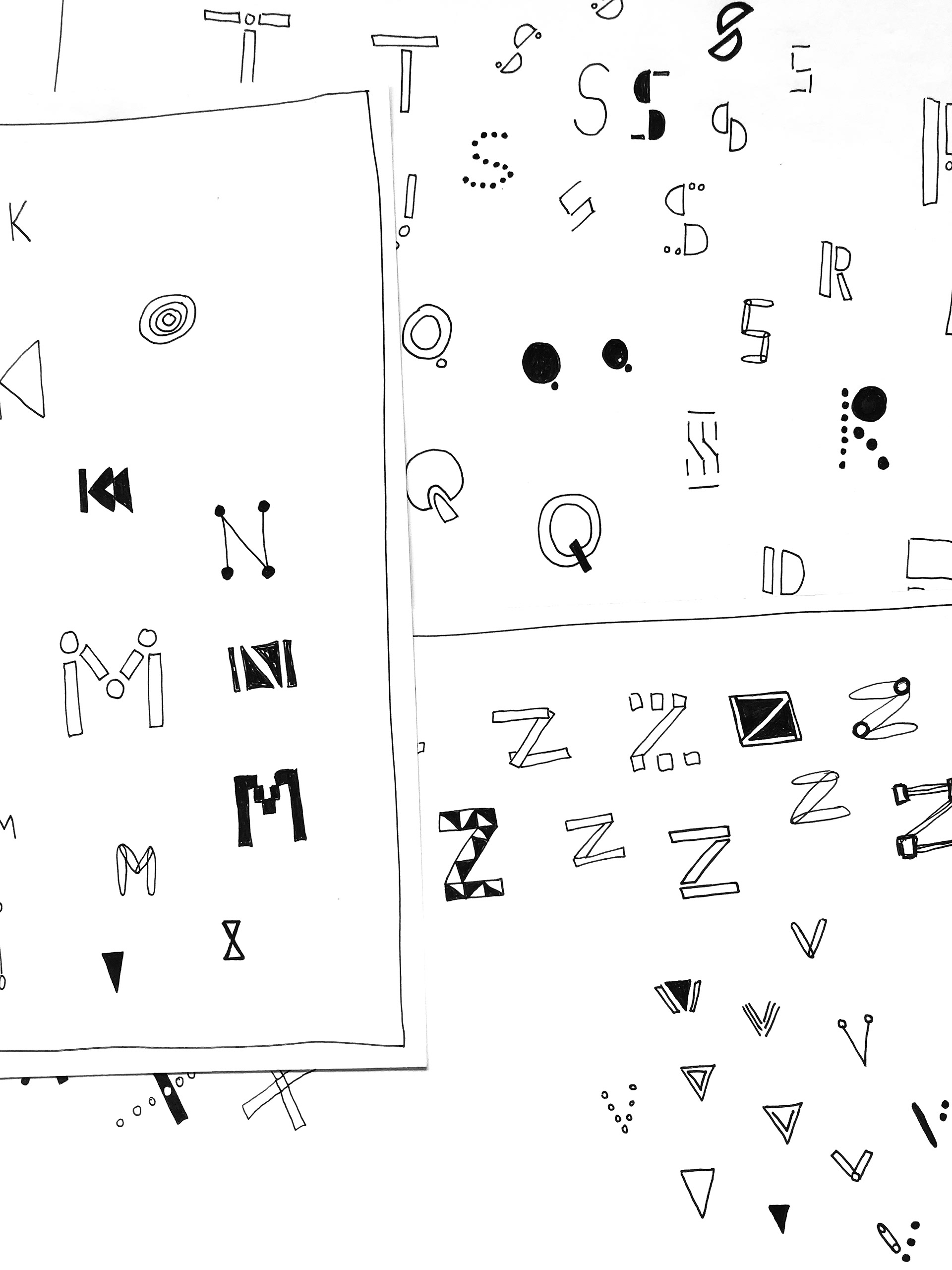
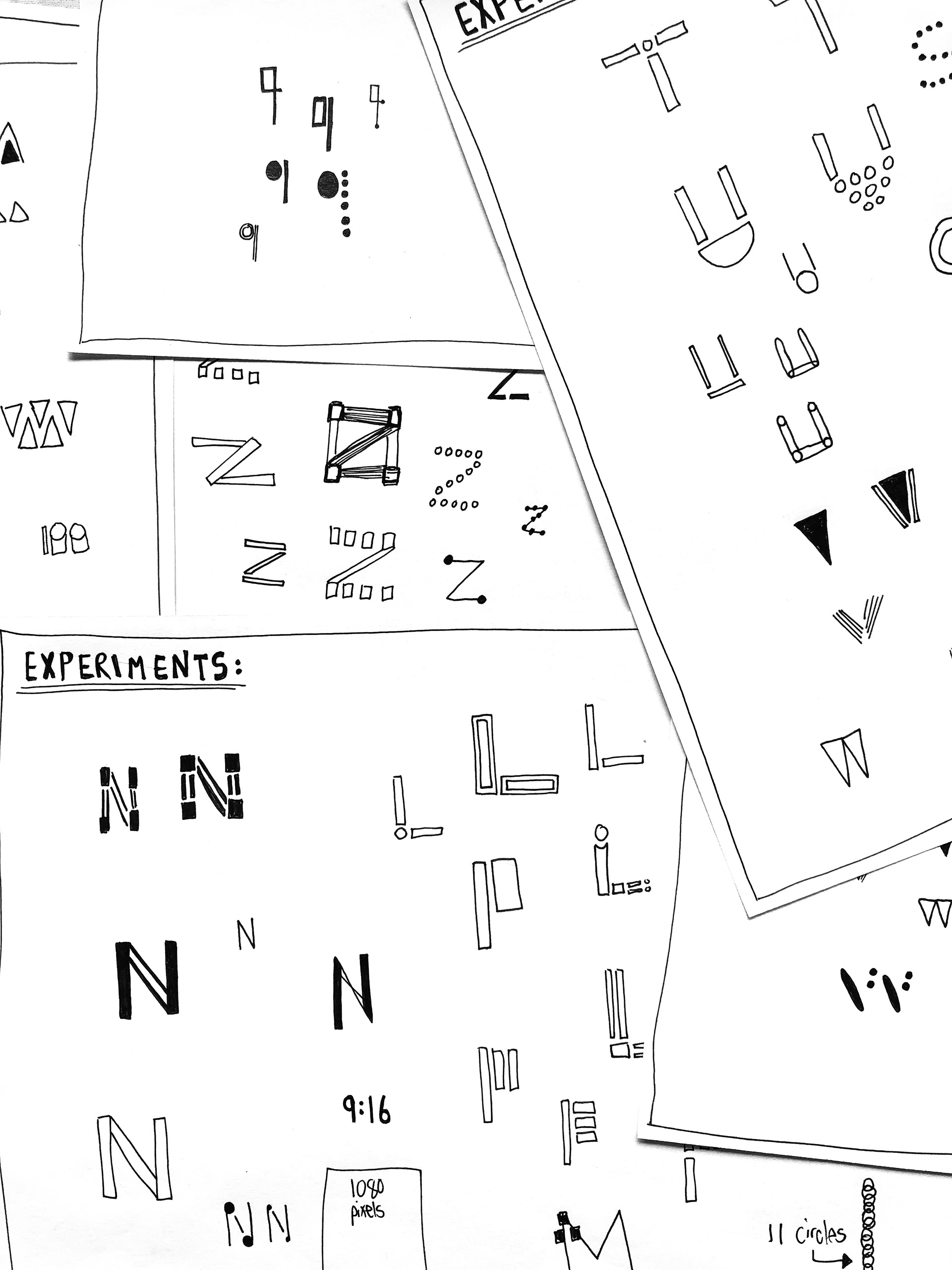
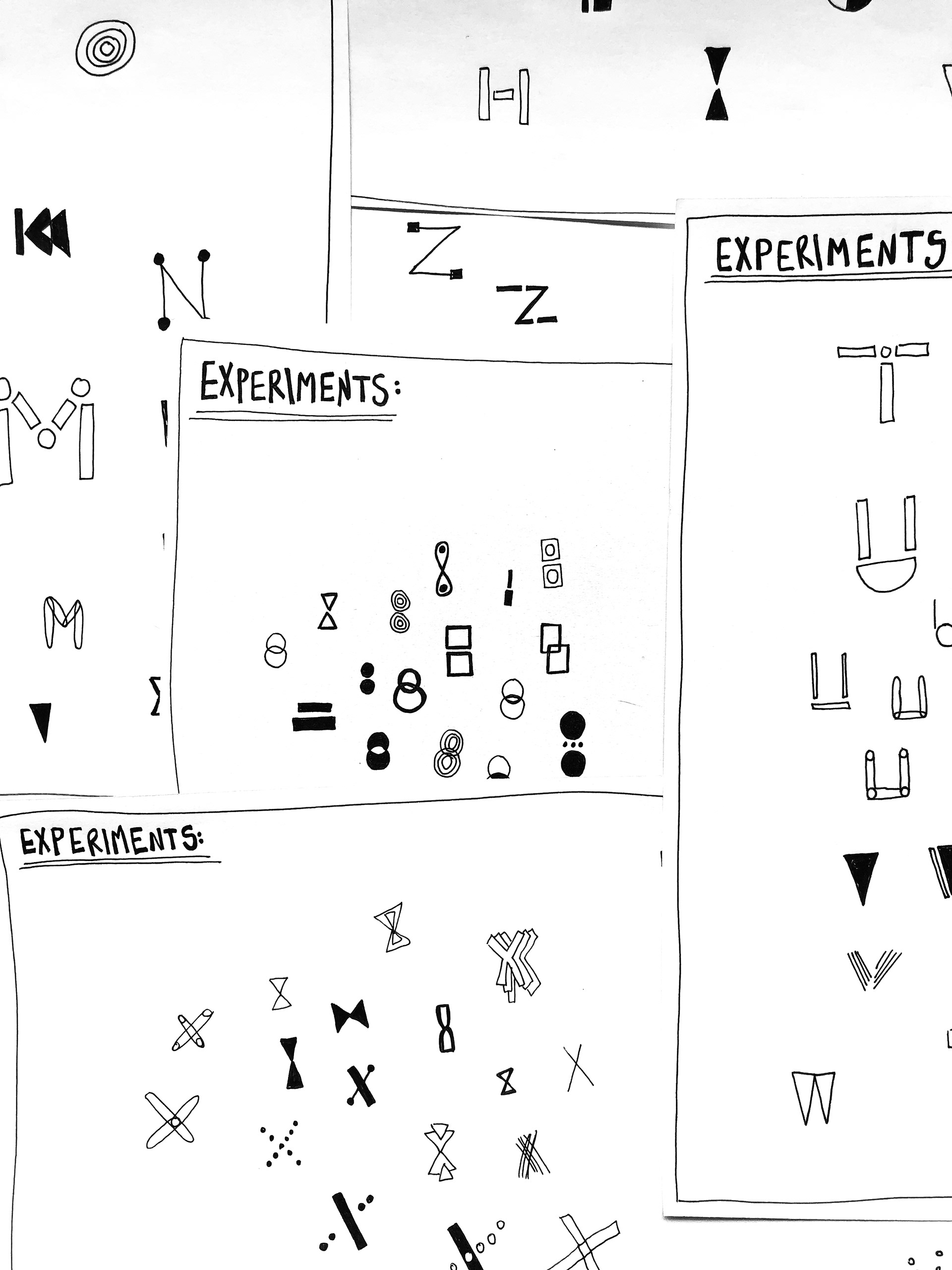
Outcome: A monochrome font consisting of 36 letters, A-Z and 0-9 which have been made by putting different basic shapes together. In addition to the font, I have created a Typographic Poster with decorative purposes which showcases each letterform next to each other in alphabetic order.
